Friday, May 21, 2021

Luminous Cumulonimbus


oil on card 30x20cm

The main subject here is, of course, the sky. It's sourced from a photograph taken a few years ago, looking north from the National Museum of Scotland's rooftop terrace. There were waves of heavy Cumulonimbus shower clouds passing over all day, and it was worth shifting myself to a good vantage point to get some useful reference images.

Most of them were more bulky than towering, and had extraordinarily soft and 'hairy' cirrus upper levels. There were also clusters of smaller cumulus forming at their bases - which is unusual – and the one in the painting had an intense white light bouncing out of its core. I didn't want to include the city skyline, though, so I needed to find an alternative landscape. A particular vista looking north in Perthshire came to mind, and - being too lazy to find that set of photos – I took the dramatic version on offer at google streetview and ran with it.

Inspired by the streetview image, I planned and carried out an interesting experiment. After the usual thin acrylic underdrawing, I put an Indian Yellow oil paint wash onto the sunlit foreground – a transparent 'stain' over the acrylic and the primer. The idea was that this would show through subsequent layers, and mark a difference between the sunlit/non-sunlit areas. Unfortunately, I then had to put a lot of effort into dulling that yellow foreground down as it was pulling the eye away from the clouds. It was an interesting experiment, though, and while maybe not the best idea for this painting, might well prove a useful technique for something more suitable.

That wasn't the only thing that went wrong (sometimes a painting will paint itself, and sometimes they resist. This one was definitely one of the latter). When cleaning off some excess blue on the clouds – a pretty straightforward action on a firm surface - some of the cloudwork got cleaned off too, right down to the primer. I had to build up the surface again, which was very annoying, and so was definitely a Bad Thing, and meant that the painting took longer than it should've done.

Every cloud has a silver lining, however, and that delay meant that my order for M.Graham's Titanium White arrived just in time for me to use it for the final highlights. Unlike most paint producers, who grind their pigments in linseed oil, this American company grinds all of their colours in walnut oil. I generally find Titanium Whites rather greasy and unappealling, but the walnut oil gives this one a lovely soft and mobile feel. It may dry a bit more slowly than the linseed stuff, but there are mediums and driers which can accelerate the drying/curing process if necessary, and this walnut-based white won't yellow as much as a linseed one. This could be quite a good find, and it's not a daft price either.

It's May now, getting on for proper summer, and - fingers crossed very firmly - it looks like the Covid emergency might be slackening off here. Madam and I have both had two jabs, and are in our post-vaccination resistance-building period. The Museum is open again for pre-booked timed slots, and with a bit of luck it'll soon be OK to turn up and ascend to the NMS rooftop terrace spontaneously, without having to pre-arrange a visit.

As I say, fingers crossed...


Thursday, April 29, 2021

Window Work - April 2021

watercolour and pencil

There's nothing finished in time for the end of the month, so I'm resorting to Window Work for this month's post.

The last 'Window Work' stop-gap was back in June last year, so I'm not that unhappy about the regularity of production of the easel pieces. The quality of the window sketches had dropped a bit in the meantime, improving slightly over the last couple of months with a return to using mostly pencil. As ever, the sketches presented are by far and away the very best examples - most of the rest are, shall we say, 'not so good'.

As ever, the subjects are just passers-by as observed while sitting (with a cup of tea and a 30-minute radio programme) looking up the road through the window. The postman – on the far right – is a regular subject, but he shifts very fast indeed. The dogs are difficult because I have no great familiarity with their forms, and I need a lot of 'seeing' to get an idea of how they work.

Of these drawings, I quite like the efficiency of the grumpy girl on the left - there's a feeling of her weight and 'slump' - but my favourite of this selection is the light and jittery pencil sketch of the girl with her dog. It's very energetic, with just enough information to let us 'join the dots' about what's happening.

Meanwhile the easel work grinds on, and I'll hopefully have some more complex pieces to present in May and the coming months.

I should just like to point out that our regular postie has never - to my knowledge - had any problems with dogs. Not on this street anyway...


Thursday, March 25, 2021

Thorney Hill – East of Auchterarder


oil on card 30x20cm

Another sky painting, the source image for which was a forgotten snap taken a few years ago. We'd driven up to Auchterarder to see a friend's exhibition, and decided to come back the pretty way through the Ochil Hills. We had stopped to snap some clouds to the north-east, but turning to get back in the car I saw this view and a much, much, more interesting sky. Thorney Hill is the small hill to the right-of-centre.

I've disappeared the central farm, lowered the wooded hill and slopes on the left, and covered the road with some fields and lines of bushes from somewhere else (not sure where).

After the drawing and acrylic wash stages, the paintwork - very thin - is mostly stippled directly on to the surface, or brushed on, then stippled out with very soft nylon brushes. The reason for that is some Bad Priming; I'd carelessly left some quite large vertical brushmarks in it. They're not exactly trenches, but they were deep enough to gather too much paint when blending laterally with a fan brush. The perpendicular stippling lays the paint more evenly in these 'gullies'. What 'streaking' there is in the clouds is more visible in the photo image, but in real life the sky is quite pleasantly ill-defined and 'gauzey' (honest!). I think it's turned out OK.

I've not much more to add about the painting itself, but I wish I had known at the time of putting this one together what else there was in the landscape. Just the other week I was following an internet rabbit-hole about brochs. These are large dry-stone built Iron Age towers – largely ruined and dismantled – with chambered walls, which I had thought were limited to the very north of Scotland. I was surprised to find that their distribution was a lot wider and a lot further south than that, and the remains of one is on top of a hill just off the left edge of the picture - called Castle Craig. I'm fairly sure that I would have made something of it if I'd known it was there, but even knowing that it's there is a bit of a thrill.

I also wish I'd known that there are a couple more in the Lammermuir Hills, within cycling range of Edinburgh, and a well-researched broch complex (Edin's Hall Broch) just a few miles north of Duns, in the Borders.

Pretty sure that I'd be planning to go and have a look if my knees were still trustworthy, but again, just knowing they're there is a bit of a thrill.


Monday, March 1, 2021

Lantabat - Summer 2020

oil on panel 61x51cm

There is some music to go with this - Radiohead's 'Daydreaming', from ' A Moon-shaped Pool'. It gives me the impression of the bright light I was aiming for in the painting, but with some pain at the centre.

The source image – found while roaming through Google Streetview - is in Southern France, near a town called Lantabat in the Pyrenean foothills.

The composition is virtually unchanged from the source, though the darker tones have been lightened. In retrospect I wish that I hadn't just accepted the upper clouds – they were almost entirely burnt-out to white, so I had to extrapolate their 'stringyness' and internal workings after studying loads of photos I took of similar cloud forms in the park up the road.

Technique-wise, everything was set in place with pencil, then the forms were developed with thin acrylic before moving onto oil layers – some of this acrylic underdrawing is still usefully showing through in the central tree group's foliage. There's quite a bit of the 'White Highlights + Glazes' technique in the ferns and foreground going into the shadows, and in the central tree group and the backlit vegetation beneath it. The figure was basically painted in monochrome, then coloured – some of it quite subtley – with transparent layers and veils (the figure is me, by the way, but not a self-portrait. I couldn't find any figures in photos or on the internet that fitted, so I had to model for myself while Madam clicked the shutter).

The middle and far landscape elements really painted themselves (nice stuff at the left going back to the horizon), but I struggled with the sky. I felt that it had to be settled and finished before developing the near central trees, which, frankly, were a waking nightmare of trying to work out what was going on and how they worked. That exercise – quite late on the painting - nicely demonstrated the perils of trying to describe three-dimensional objects from a less-than-perfect two-dimensional source.

Taking the piece as a whole, there's a healthy variation of marks here – all fairly thin paint of course, but exploring a textural range from softly blurred and faded to sharp-edged and textural. I like the overall light, and am quite chuffed with the painting of the figure – it conveys a lot with very little information.

A painting can be about more than just marks though. This is a (hopefully) beautiful landscape with a dark thing in it, but I think it's also about looking how a 'low' – a feeling of depression or negativity – can isolate a person from their surroundings. Last year's summer – dominated by the Covid pandemic - was all about uncertainty and isolation, and I don't think it's a surpise that a little of that has seeped into this painting. The figure is deliberately open to interpretation – he could be asleep, ill, dead, or just hiding himself away, and there's no narrative present to guide the viewer. Personally, I think the figure is turned in on himself, huddled away from the light, and limp, and passive. It makes me think of someone who is experiencing despair, and a lack of hope.

I confess that I did get into a bit of a 'low' towards the end of last year. I found it very difficult to work and summon up any interest in getting ideas sorted. Having to get work finished for this blog was really the thing that got me to the easel, and I can't pretend that working at this and other pieces hasn't been a slog. So, I'm very relieved that this has turned out well. I think Madam is as well – she wants to keep it, and doesn't want it to be sold.

And finally, for anyone following the Great Shishkin/Levitan debate – and who isn't in these febrile times – I think this painting's treatment of foliage and landscape tends towards the more detailed Ivan Shishkin camp, though I think I could have done with more of Izaac Levitan's seemingly effortless simplification of forms, especially in that damned, and double-damned, foliage.

On to the next one then - more on Mr Levitan's side of the road with a bit of luck...


Friday, January 15, 2021

Three Islands - Cumulus

oil on card 30x25cm

This is the first piece finished this year, sourced from a photo I took from Blackford Hill, looking northwards across the Firth of Forth to Fife.

There is a very short, light, ambient track to go with it – Max Richter's 'Time Piece'. It floats in the way I wanted the big cumulus to.

This little painting is all about that big cloud, of course, with only very basic compositional input from the earthbound elements. The water, a much wider expanse than in real life, was photoshopped in from another photo during the composition stage – superimposed over the unwanted bits of Edinburgh that were in the Blackford Hill picture.

Technique-wise, it's worth noting that the blue in the sky and the distant haze is straight Indanthrene Blue with Zinc White. This pigment is known under various names, e.g. 'Anthraquinone' and 'Delft' blues, but its pigment code is always PB60. I've seen it referred to as 'Indie Blue', so that'll do for me. I actually bought this tube a few years ago, but hadn't really bothered with it until now. It's a very transparent pigment – great for glazes – and on the palette is as dark as Prussian Blue, but it doesn't have that pigment's strange blackness. To my eyes it's slightly less violet than Ultramarine and doesn't have the malevolent aggression of Pthalo, so it turned out just right for the pure blue of this sky. Its one drawback is that it's a series four colour, so on the pricey side, but a little does seem to go a long way.

While I'm still talking technical, I feel I have to roll back a bit on my previous enthusiastic advocacy for caran d'ache crayons in underdrawing. In this piece they were fine for placing the cloud forms – where the next layer was oil - but when I laid the thin acrylic washes over the very water-soluble crayon of the landscape, the underdrawing simply dissolved. And very efficiently too. So while I'll continue to use caran d'ache for marking out skies, it's back to the light pencil under acrylic washes for now. Sorry about that.

There are three of the many Forth islands in the picture. They're not particularly obvious, which is partly why they're in the title, so you might have to look for them. The nearest is Inchmickery. To the right of that is a lump of rock called Car Craig, and to the left, closer to the far shore, is the largest – Inchcolm. The Firth of Forth is not usually known as a theatre of war, but all of the larger islands were fortified quite heavily as part of the Rosyth naval base defences – and their anti-aircraft batteries were fired during the first air raid on Britain in 1939 (a train was crossing the Forth Rail Bridge at the time, which must have been terrifying for the passengers). Inchcolm – 'Innis Choluim', Columba's Island - is the most developed. It's a strange combination of abandoned anti-aircraft defences, and the medieval religious buildings at the sheltered bay. The island became a monastic and religious centre in the 9th century and Inchcolm Abbey itself was founded in the 13th century. It is now no longer in use and mostly a ruin, the Scottish Reformation accomplishing what multiple English raids failed to do. There are regular tourist boat trips there out of S. Queensferry. The boats' route goes by an island where there are hundreds of puffins, passes over Mortimer's Deep – a very deep channel between Inchcolm and Aberdour - and as the boat returns to the south shore of the Forth, you'll get your second chance to gawp at the two magnificent Road Bridges while staring up at the Rail Bridge as you pass under it.

And if you've of heard of Aberdour, but are not quite sure why, it may be that you heard from the final verse of 'Sir Patrick Spens'...

'Haf owre, haf owre to Aberdour,
Tis fiftie fathom deip,
And thair lies guid Sir Patrick Spens,
The Scots lords at his feit.

(Anon)


Tuesday, December 1, 2020

Red Wood - Neuvillette


oil on card 21x15cm

This is the fourth and last of this year's Small Scale series. The location is in North East France, just north of the River Authie valley.

I found this location a quite a few years ago, but hadn't worked out how to use it until now. Looking at this spot again, it clicked that the most important thing wasn't the autumn colour, but the quality and direction of the light*. The colours are very clear, yes, but the low sun is casting some very interesting light and shadows - my main point of interest being the shadow falling into the dip to the left of the wood, and the sunlit rising ground beyond it. All supported by the streaky shadows of unseen trees to the right.

The initial placings (pencil, but light blue crayon clouds) were developed with light Raw Umber acrylic wash - quite densely in the tree shadows - and most of the subsequent oil colour was very thin, and in transparent pigments. Opaque pigment was only really involved in the foreground field, where I deployed Unbleached Titanium Dioxide as a base – and that maybe helped to establish its nearness to the viewer (or maybe not).

There was an interesting use of white pigments in the sky. I was building up the sky colour with thin Ultramarine - zinged up with a touch of Pthalo Blue - and Zinc white, and I misjudged my second layer. I'd added too much Pthalo Blue, and had to do something to make it stop hurting my eyes. I applied a thin warm grey 'veil' - Paynes Grey, Burnt Umber, a touch of Ultramarine Violet, and a 50/50 mix of Zinc and Titanium Whites** - and softened it away gradually towards the horizon (Badger blender again). That calmed the sky down just enough, and produced some blues which were more subtle and interesting than if I hadn't had to sort out my ghastly mistake. Luckily.

I'm quite pleased with this piece. The scare with the toxic sky apart, I really enjoyed playing with the patchwork of colours within the wood, and working the strong directional lighting. Likewise the soft shadows fading away from the right picture edge, and the faint streaks of cloud (deliberately unreinforced after the last 'veil') - both quiet and undramatic, but effective.

Overall, I'm very happy with this set of very small paintings. I was short of time, so had to make fairly simple but strong compositions. They were all spray varnished successfully - each had an initial coat of gloss, then the first three sprayed with satin varnish to calm them down a bit. This one had a second layer of gloss – to give the transparent colours maximum pop. And that's them away for now - job done.

The whole Small Scale show – several hundred pieces I think – is at the Open Eye gallery in Edinburgh, and is up online here. Due to Covid etc (at time of writing , anyway), if you want to view a running selection of them face-to-face on the wall in the gallery, you'll have to contact the Open Eye beforehand to get a time-slot. Also, the paintings will be taken down and replaced as they get sold, so if you're interested in any pieces in the show – (not just mine!) - get on the phone or email the gallery sooner rather than later.

This is probably going to be the last post this year, so I'll wish everyone a good holiday over the festive season, and be hoping that 2021 will bring some good things with it - despite everybody's present travails and frustrations – and good health.

Cheers, and Happy New Year when it comes...


* If you're looking for a startling show of rich autumn colour you could do worse than click the location link again, and turn south-west into the sun. Follow the road for about 800-900 metres, and there's a gloriously rich autumn wood on the left.

** I should mention that cobalt driers/siccative was added to these paints on the palette, as they are two of the slowest-drying common pigments on the planet. I usually add it to my mediums, and then mix those into the paint, but adopting the habit of mixing-in one or two of drops of driers per 2 centimetres or so of squeezed-out Zinc or Titanium White will literally save years of waiting-to-dry time.


Sunday, November 15, 2020

Inselberg - Nimbus

oil on card 21x15cm

This is the third of the four 'Small Scale' paintings to get finished, and there's some music to go with it - Brian Eno's 'The Secret Place'. The album, 'Apollo: Atmospheres and Soundtracks', was playing while I was immersed in the cloudwork, and this track cut through and resonated. I quite liked its cold emptiness with a hint of 'hidden bulk'.

The composition is near as dammit a transcription of the source location – in Iceland, taken from google streetview. I think the hill has been stretched vertically slightly, and there's been some adaption of the foreground to make it read better. The distant rock on the right is actually much nearer to the viewer than described – it was drawing too much attention to itself, though, so I moved it back with a bit of grey haze. Now, instead of being small and near, it's big but far away.

Now, the title: A Nimbus is a cloud of any form – like Cumulo-nimbus or Nimbostratus - that has rain, snow, or hail falling from it, and an Inselberg is an isolated mountain or hill. This one is Hjörleifshöfði - which should really be in the blog title, but I felt some pity for the staff at the gallery who'll have to type that out and possibly be asked how to pronounce it. Not being a cruel man, I settled for something more prosaic instead. If it helps, though, the 'ð' is pronounced like the soft 'th' in 'then', 'there', 'other' and 'smooth'.

Technical-wise, this piece is done in the usual sequence of pencil, acrylic wash, then oil. It was the third to get started, and just about painted itself – which was a relief. It suffered the same uneven priming as the others, but I didn't worry too much and just got on with it. My cheap soft nylon blending brushes had suddenly begun to be less effective – no idea why, perhaps they are stiffening up or hadn't been cleaned properly – so I used my good round Badger hair blenders in the sky. I had got out of the habit of using them, but the results were so positive that I forked out for some mid-size Badger flats from the same supplier. Badger hair is narrow at the base and bellies out before the point, so it has a natural splay. It's very tough and resilient, but surprisingly soft, and produces a very fine fade or blend when lightly touched into the wet paint.

It's the hair used for classic shaving brushes. My Dad's first job was as a barber's lather boy - preparing customers for their shave - and it was a nice thought to be using the same material. Apparently Badger hair brushes improve with use, rather than deteriorate. Which is good news, even though I'm not sure what that means.

I am quite pleased with this little piece. The composition is strong but very simple, and was quite liberating to paint. I like the subtle blue tint on the denser Nimbus just above the mountain, and the Raw Umber glaze that glves the low band of light a slight tarry look.

That's all four of them taken down to the gallery now – The Open Eye Gallery in Dundas Street. The show – the annual 'On a Small Scale' - will mainly be on-line, but it'll be open to view subject to social distancing. It should go live at the beginning of December. Because there are so many tiny paintings on show the staff will be quite strong on limiting the numbers in the gallery at one time, so it might be best to get an appointment first.

I'll post the last one of the four come December, but it'll be up on the 'On a Small Scale' section when that goes live if you can't wait. See if you can spot it...


Sunday, November 1, 2020

Pobedino

oil on card 21x15cm

This is the second of the four 'Small Scale' paintings to be posted. The location is near a village called Pobedino - in the Russian Kaliningrad enclave, just to the east of the Russo-Lithuanian border - and is all about the sky. Of course.

It's done to the usual basic drawing, acrylic wash, then oil paint system, but this time with a small tweak - I used a pale blue Caran d'ache crayon for marking out the clouds. Any crayon that is visible through the oil layers blends in a lot better than a pencil mark would, and will be embedded within the paint a lot more securely than graphite. I'd be loathe to advocate painting on top of thick blocks of crayon, but I'm fairly happy with light lines of it. Caran d'ache comes off the priming with an eraser a lot easier too – with none of graphite's greasy streaking – and if necessary it can wiped off with water.

I've always been uncomfortable about using pencil for the initial drawing and placing. A couple of my painting tutors at college had discouraged it as they were of the opinion that the graphite would seep upwards through the oil paint to appear on the surface many years later. The reason that I'm reluctant to use it is because it is a very weak and slippery material, and anything laid onto it is liable to be very easily peeled off later. When we use pencil to draw on paper and smudge it for effect, we're making very good use of graphite's loose structure, but it's usually a wise move to spray a fixative onto heavy soft pencil to 'lock' it.

Not that graphite is totally 'The Devil's Artstick' – as I've already said it's a fantastic drawing material - it's also an excellent dry lubricant, and is widely used for smoothing stiff locks and keys. Nuts & bolts, and screws, also turn better with a scrape of pencil lead, and I've sorted many a tricky zip by running an HB up and down it. In past workshop days, I used to rub a block of graphite along my wood lathe bed to ensure a smoothly gliding tailstock without it gumming up with oily dust and shavings.

I'm quite happy with this painting, despite a little mini-crisis of confidence about the cloud tones (I went with light and atmospheric rather than dark and heavy), and I'm very pleased with the soft blue I mixed for the sky layers and thin line of far horizon (Ultamarine, Zinc White, some Ultramarine Violet, and a touch of Burnt Umber, if you must know). An honourable mention has to go to the little stray puff of cumulus to the upper left – it's the best piece of cloud painting there. It was done with the least amount of effort per square inch, and I still have absolutely no idea how that comes about.

Just to end, a bit of sad news. One of our tutors from Edinburgh College of Art days – David 'Dai' Evans - died a few weeks ago. He was much-liked and respected by his students, interested in what we did, and who we were (not always the case with other tutors), and always helpful. Dai was a highly skilled and interesting painter & draughtsman whose final style was about simplicity and subtlety.

Madam bought me a 'Small Scale' painting of his a couple of years ago - a beautiful little cup and saucer still life. It's a delightful little painting, and each time I look at it, it gets better and better.


Tuesday, October 20, 2020

Bright Cumulus - Denmark


oil on card 21x15cm

This is the first in a series of four little pieces for the Open Eye Gallery's annual 'In a Small Scale' show in the run-up to Christmas. This was the first to be composed and started, and is the first to be finished. 

Right. There is some music for this one. It's the first two pieces – 'Spring 0' and 'Spring 1' - from 'Recomposed'*, Max Richter's take on Vivaldi's 'Four Seasons'. The painting is more connected with the atmosphere and thrill of 'Spring 0', but the very recogniseable 'Spring 1' kicks in fairly quickly, and really, it's too good to leave out. 

This piece is all about the light - the incandescent clouds (cumulus humilis again) floating in the glare over the pale landscape. There's been a little rearranging of the fields and disappearance of farms and buildings, and the horizon has been made to seem further away than in the google streetview source

As usual, the landscape forms were placed in light pencil, quickly filled with black acrylic washes, then developed fully with oil layers. The sky was done entirely in thin oil paint. 

I had hoped that perhaps this one might paint itself, but I struck a problem as soon as I laid in the first sky layer. I'd think I'd been a little too casual with my priming, and the first blue tint was patchy and uneven. Subsequent layers sorted that immediate problem out, but that meant that my 'watercolour paper white' base had gone, which was a disappointment. My acrylic washes were too dark as well - I shouldn't have used Black. Raw Umber – which I've used before - would have been much warmer and lighter, and more helpful. The deadening base worked directly against building up the landscape luminosity - the semi-transparent light colours of the fields and trees were immediately 'cooled' by the dark grey underlayer and then need to be 'warmed', which was both annoying and unnecessary. However, I'm very pleased I managed to make the clouds quite bright without clumpy great clods of white – by using a series of thin layers with firm and blurred edges. 

The whole thing did take longer than it needed to, and isn't quite the sizzling study in light that I had in my head, but it's not a bad result, though, and the music's lovely... 


* A complete re-imagining of Vivaldi's well-known work. The more original elements are played and recorded by a string orchestra, and there's then a section of electronica which draws heavily on the 'birdsong' elements and sampling. Finally there are a few even looser re-mixes. Worth a listen if you can. 

Thursday, September 10, 2020

Winter Sunlit Cumulus


oil on card 33x20cm 

This dramatic late afternoon winter sky is sourced from a set of photos I took on Bruntsfield Links, looking north at Edinburgh Castle and the old Royal Infirmary buildings (which have all been photoshopped out). The landscape source is another view of the location used in 'Passing', turned left to right with a treeline added on the left and the feature trees removed. I just needed something interesting but not too dramatic to anchor the sky to, and picked this out from the volumes of landscape images clogging up my computer. 

Having finished the painting, it looks like a snowy landscape. The sky is deep winter – it was January – but in the landscape the trees are in full leaf. I altered the landscape colour to match the sky, and it's just 'accidentally' ended up looking wintery. I quite like the fictitious snowy mauve though. 

As is usual now, the landscape features were pencilled in, forms and tones built up with monochrome acrylic washes, then transparent and semi-transparent oil layers laid on. There's no pencil or acrylic underdrawing in the sky – the fairly accurately placed landscape features acting as a 'ruler' against which to place the cloud forms horizontally.

I'm more usually trying to find the light in a painting, but this is really more about the supporting darks, and it's a bit of a change of palette. I took a long time arriving at the right tonality, possibly because I was working the earlier stages from a lightened version of the composition so as to see the ground details more clearly. It didn't exactly help that the end-stage pink glazes took a little too long - they were made up with Indian Yellow, Alizarin Crimson, and a touch of Zinc White. These are some of the slowest pigments I have, and I neglected to add extra driers to the mix, so they took ages to dry. Cracking colour though - the Alizarin/Yellow was a combination I used a lot in my Early Phase of painting in the 70's and 80s.

As it happens, combining Yellow and Alizarin Crimson was one of the major building blocks I was given at school – I was trying to paint a fiery phoenix for some reason, and when I added white to my school-grade crimson poster-paint to make it lighter it went an uninspiring cool pink. I must have looked rather obviously at a loss, and my Art teacher, Mr Knight, popped up at my shoulder out of nowhere and suggested I ditch the white, and lighten the dark red with some yellow instead – and a very important door opened in my head.

Which is what education is all about I suppose...

Thursday, July 23, 2020

Three Altocumulus

oil on card 30x22cm

The starting point for this little painting was another photo of trees snapped from a train window, possibly in West Lothian somewhere, but definitely in early May a few years ago. The sky was clear, but the clouds were clipped from a more recent photo taken out of the front window. I quite liked the combination of the turbulent dark foliage below and the stable trio of altocumulus clouds above.

Technically, I went a bit round the houses with this one. The trees and ground were pencilled lightly onto the priming, then the landscape toned in with thin black fluid acrylic. The watery acrylic provided quite a lot of useful foliage texture itself, but I took that further with fingers and thumbs into the blobs and washes. I started the oil layers with thin, even glazes - blue in the sky, and a transparent yellow-green over the landscape – the black acrylic showing through quite plainly. It was then all about pumping light into the sky, and dulling down that acid green - while making the most of the tonal drawing and texture coming through the layers. Obviously, towards the last sessions there was precious little of the finer under-texture showing through the more worked darker areas, but it does still show - with some faint pencil too - in the more lightly developed areas like the right treetops against the sky.

There was a bit of trouble with the near foliage in the lower right corner – it became too detailed and there was so much contrast within those tiny marks that I had to go over them with a thin grey to knock them back and stop them popping. There's also a bit too much cat hair in the sky for my liking as well. I try to minimise the paint-to-hair ratio by covering up the brushes when nopt in use, and making a point of not stroking the cats prior to applying glazes, but I think this problem really is at the periphery of my zone of control. On the good side though, I do like the skyline on this one, where the the trees are faded and bleached out under the bright light. I'm quite chuffed with the restraint of the brighter atmosphere at the horizon – it would have been very easy to overdo it.

To sum up, this one went quite well, and I quite enjoyed doing it. Hopefully I won't have to push future paintings to an extreme state and then rescue them, but that was actually quite an interesting round trip. I'm feeling keener about painting after a rather unmotivated spell, and Covid lockdown's gradually easing in Scotland so (fingers crossed) I'm looking forward to gadding about to see a few galleries soon. 

Oh, and my knee's just about back to normal too...


Thursday, July 2, 2020

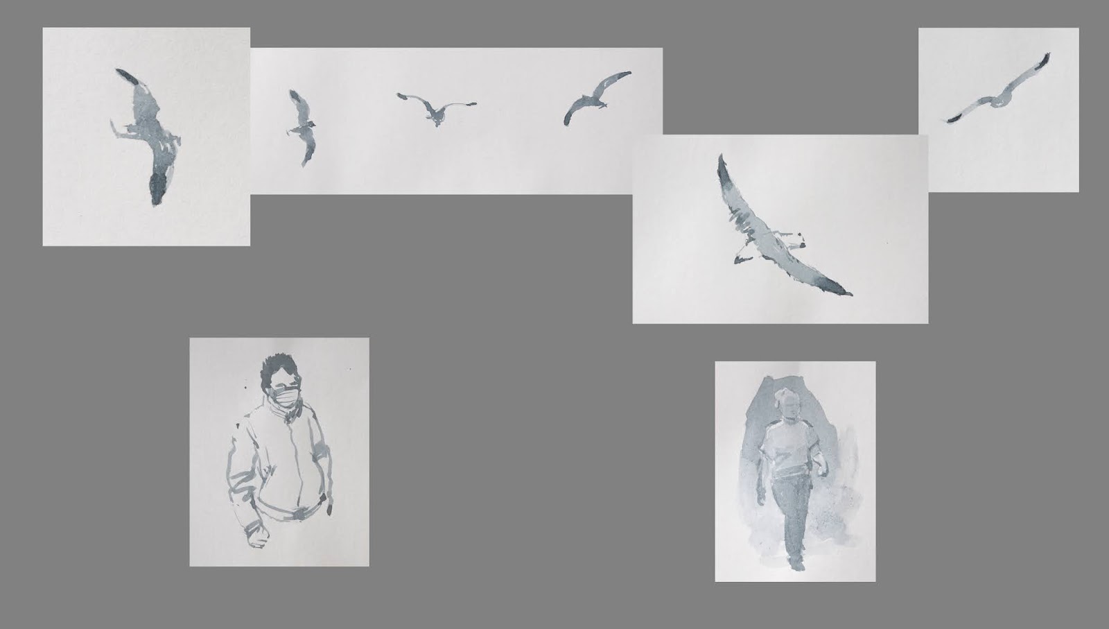
Window Work: Covid Lockdown - June 2020

watercolour

Window Work again, in unusual circumstances though. During the early part of lockdown there wasn't much activity going on outside in the street at all, just a few intrepid souls walking nervously down the street, widely avoiding other nervous walkers - but there really were a lot of seagulls.

As usual, these little sketches are in Payne's Grey watercolour, all done with a smallish Oriental brush, and I've had some fun arranging them for the final image. 

There's been some disruption to the easel work this month (nothing to do with covid). My regular work pattern was interrupted by preparing and priming some more panels, knackering my back (once) and a knee (twice), and by having to buy a new camera. The previous 'good' camera ceased functioning not long after posting last month's blogpost, and familiarising myself with the new one has necessitated a certain amount of urgent research and finding out which button does what, and why. The daily routine's back to normal now, though. Or soon will be. 

There's not much more I can say about these little drawings, except that remembering what birds look like when they're flashing through the sky can be very demanding. This selection is the best of a (very) bad hit rate over the last few months, but the few passers-by and the mask - in contrast to the raucous vigour of the local wildlife - sort of reflect how this spring has been.

Mind you, reticence has never really been a problem for the Common Gull...


Sunday, May 31, 2020

Dog - Altishevo

oil on panel 60x50cm

Some paintings sweetly acquiesce to their creation. They dance with the painter, and guide and suggest where we should go. These are enjoyable experiences, and are remembered fondly. 

Not this one though. This one was a bad-tempered brawl from start to finish. If it had a soundtrack, it would be the grinding and gnashing of teeth.

The starting point for this painting is near Altishevo, a small town near Kazan. What struck me was the light, and the path between the tree masses. I thought it a very beautiful and potent setting – if a little complicated.

The eventual premise of this middle-sized piece ended up being similar to that of another painting from a few years ago – 'Moment'. They both feature a dog sensing something in the woods. I've re-used the same dog photo that I found for Moment - it's been flipped horizontally, has reverted to its original colour, and now has another dog's head, but it is essentially the same 'model'.

I think this painting and I got off to a Bad Start right from the beginning. I tried to save time by not drawing & placing everything as thoroughly as I maybe should have, and was too hesitant and timid in trying to build up the surface. I didn't arrive at workable realistic tones soon enough, and I was using too-big brushes for too long – so nothing got defined properly until some time later on, by which point I had already got mightily fed up and frustrated with it. There was confusion right to the very end about where and when to use opaque or transparent pigments and soft or hard edges; the second-last session was spent softening out a whole lot of distracting hard edges in the left trees (fine stippling with a small soft brush and sticky mixes of paint & stand oil, with added driers).

I was aware that I was having trouble simplifying the general complexity of the trees, but I also knew that, behind that, the painting lacked 'kick'. About a third-way through I realised that it was crying out for something else - a dog and/or a figure, and perhaps getting that decided a lot sooner would have helped with everything. Ninety per cent of this piece was plain hard slog, and very unrewarding to do. I'd love to blame that on the Covid Lockdown, but deep down I know full-well this difficulty was really due to me and my lack of concentration. 

While painting this was not a pleasant experience, that doesn't mean there aren't any good bits of work within it. The sky works well - and was the most efficient piece of painting. The far sunlit birches look as though they might have been quickly done too, but if fact I had about three goes at getting them to how I wanted them. In fact the whole central section – the far birches, the path through, and the red larch(?) are good bits of paint. Likewise the fir and the tree to the right are individually quite interesting. The dog's not bad either, apart from a couple of its legs, and I'm glad I decided to apply the risky blue glaze that finally pacified the whole ground area.

Years ago, my Dad - every now and again - would bemoan my tendency to over-complicate things. I actually do think my work benefits a lot from the crafty technical stuff, but in this case, he is absolutely spot on. 

Pretty sure he'd still have loved the finished painting though...


Tuesday, April 28, 2020

Ochils, Wheatfield, and Humilis

oil on card 32x20cm

Firstly, there's some music associated with this. I was having a lot of trouble with the initial painting stages, then at about the fifth session (of nine) I had 'Memoryhouse' on while working, and everything seemed to settle out (although the rain's got nothing to do with the painting).

The source for this little painting was another, not very recent, snap from a train – taken three-and-a-half minutes east out of Stirling station, and looking North across the Forth towards the Ochil Hills. I've edited out a lot of electricity pylons and a mushroom farm, and have completely eradicated the town of Fallin. You can see the railway line and a general view here, though the weather's not quite as nice.

Compositionally, this one started off being all about the dark central trees and the perspective rush of the yellow field and its green 'scar', but as the painting developed I became more interested in the sky and the hills. During the photoshop compositional phase, the hills were reduced in size so as not to loom - as they appeared to when the photo was cropped – but they grew in importance as the painting progressed. The problems of the later stages of the work - as the balance between the sky & distance and the near fields & trees changed - were all about how to make the foreground solidly convincing, while at the same time not distracting from the really satisfying paint of the distance & sky.

Technique-wise, I'd decided to paint this in thicker paint than usual – with no acrylic underdrawing or tonal stuff. Not sure why, perhaps just to see if I could still do it. Well, that fell at the first hurdle. After very lightly placing the main elements in pencil, and plonking in the distant darker trees, I couldn't see how I was going to get the 'aerieness' of the sky and hills in thicker opaque paint. I did manage to do the mid-distance and foreground relatively thickly (for me), and I even used striated brushwork to help with the yellow wheatfield – and this may have helped a little when it came to the subsequent thinner layers. The hills were built very simply – first the blue-grey rocky bits, then the lighter grey-green bits to fill in and cover the white priming. Finally, they had a couple of thin blue-grey scumbles evenly stippled over them, which were gently finessed off with a very soft dry brush where I wanted the nearer slopes to be clearer.

All in all it was a bit of a grind though, and I'm not at all sure that I was seeing the two foreground fields properly or understanding how they worked. But there we are.

The best bits in this one? As usual, they were the bits that were painted without fuss or strain, and in this little painting that's the sky & hills. I'm very pleased, though I say it myself, with the colour and texure of the sky; I find it very satisfying and peaceful – definitely a Good Thing in these fraught and uncertain times. 

I'm also very chuffed with the tonal restraint in the clouds. They are Cumulus Humilis, and I think they deserve to be in the title.


Monday, March 23, 2020

North of Muthill

oil on card 30x20cm


The source for this little painting was a photo I took a while ago from the bus travelling south on the A822 from Crieff, just approaching Muthill ('Mew-thill', not 'Mutt Hill'). It's difficult to say where exactly along the road the photo was taken, as the view (front seat at the top of course) was way above that of the google imaging car. This is my best guess though.


There's no meaningful music for this painting, though I did happen to be listening to these Bach Preludes and Fugues a lot while working. (Great for helping with concentration while painting, and for any stress reduction you might be in need of just now)

As ever, my snap was merely the starting point for the whole composition/painting process. It was flipped left to right, the distances exaggerrated, and a whole mass of trees on the left were vapourised to expose the uninterrupted skyline. The heavy cloud on the left was shifted in slightly, and the right foreground bent up a bit to stop the whole thing sliding away off the corner.

On the technical side, I had a little experiment in colour zoning and underpainting. 
(This bit may get a little dry – might be easier to go the 'Works in Progress 2019' page, flick through the sequence, and maybe have look at the 'info' panel there)
I wanted there to be three 'keys' of colour – landscape, blue sky, and white sky. I needed the terrain, trees, etc to be dark and muted, so they were quite finely developed with black fluid acrylic washes – to kill off the white primer and get my drawing details fixed. The sky was to be generally as light and clear as possible, but with a blue area to the left and a white/grey area to the right. So, after placng the cloud forms in faint grey oil (Paynes Grey/Zinc White), the left area had a thin, transparent, Ultramarine/Prussian Blue/Zinc White glaze. Meanwhile the forms on the right were built with the grey glaze over the white primer. These three colour 'keys' – black, blue, and white - showed through and affected subsequent semi-opaque and transparent layers of development. 

I'm very pleased with this little painting. The clarity of the blue works very well against the dull landscape colours, especially when it's looked-at in clear blue-sky daylight, and I think the sectored underpainting and base colour strategy has been very successful. I'm also quite chuffed with the efficiency of the landscape; the marks are actually fairly rough close-up, but work very well at this scale. Madam likes the tiny grey cloud in the central blue area, and I really like the changing quality of the light and colour along the horizon – in particular the blue haze behind the main tree as it fades into the grey on the right.

There was a small accident the day after I'd finished it though, and it brought me to a blind and cursing rage when it happened, but which I now think I may get away with. I had bought some big 8'x4' sheets of hardboard which had to be cut down a little for stacking. I'm crammed for workspace, so I'd moved this little gem out of the way to a much higher position on the easel. So having done my first cutting, I picked up the big sheet, raised it to carry it back into the hall, and it flopped (oh foolish thoughtless me) and a corner of it just touched – stroked - the surface of the painting. It's left a very shallow trace, almost imperceptable but for the track being matt and the surrounding surface more glossy. It's very difficult to tell just now whether there is any real damage to the tone and colour. I have decided to let the picture cure thoroughly, and then judge in a few months whether a retouch is needed. The paint surface still has more settling down to do, and then, hopefully, an overall satin varnish might lessen the visibilty of the surface damage and unify it enough to be virtually invisible. 

I know not to push my luck though - the hardboard skimmed the two more substantially painted clouds, and lifted away from the surface just as it passed over the patch of clear blue sky between them. The lightest touch there would surely have scored through to the white, and entirely ruined the painting

We'll see, but I think I may just take that fluke of serendipity, and accept it as a win...

Post Script October 2021 – I examined the surface closely again pre-varnish, and decided it didn't need any attention. It's varnished now, and looks great