Wednesday, September 12, 2012

Mariane’s View

oil on papered canvas 31x25cm


A commission…

A friend of mine’s wife, Mrs R, used to see this every morning on her walk to work. It’s from the road between Easter Craiglockhart and Wester Craiglockhart Hills, and on a good morning you can see Berwick Law - the distant triangular peak framed by Arthur’s Seat and Blackford Hill. She doesn’t do that any more but remembers this view, so Mr R asked me to do a painting of it.

I wanted to emphasize the peace and calm, with a nod towards the atmospherics of Claude Lorrain . Mr R specifically wanted an indication of the steeples and roofs of West Edinburgh, and these tied in quite nicely with the chimneys of the power station along the coast, though I did remove the rather intrusive clubhouse. Shifting Arthur’s Seat and Berwick Law slightly made the horizon more balanced, and I uprooted and transplanted some of the trees.

Painting-wise, I’m very pleased with the ‘scoop’ of the fairway and how it curves around the hillside – quite tricky. Lucky that the groundsman’s mowing lines were so crisp or it would have been very difficult indeed to describe. 

I’m quite chuffed with the sky too, and the oil drier/siccative really came into its own here. I wanted to paint it with tinted ‘veils’ using the most transparent white, Zinc White. It lends itself to subtle aerie floatiness, but it is a dreadfully long drier – even without adding any extra oil (walnut, Waitrose own brand). With a drop of driers though, thin layers were firm enough to stay put after a couple of days. Which was astonishingly fast.

So, job done and there it is, and all without a single golf metaphor. 

Oh all right then… The opening drive was strong, but landed in an awkward bit of rough, necessitating slight re-composition of the hill and sky on the left. After that I didn’t get caught up in any bunkers, and kept my nerve for the final putt. 

Par for the course, really… 

Thursday, August 23, 2012

Bad Valley

oil on canvas 51x51cm

This is a pure landscape painting - the landforms and sky being the subject – with no symbolist or metaphorical insertions.

Well, almost. It’s actually a mash-up of two contrasting nasty/nice elements. The valley is dark, winter, and concave, the hillside light, summer, and convex. The idea is that the viewer feels attracted towards the breezy optimism of the sunny upland. Alternatively, I suppose, you could just stay in the valley if you’re feeling a touch melancholic gothic. 

The grassland, near Cerne Abbas in Dorset, was sourced from google Earth, but I found the dark valley myself. It’s not far outside Edinburgh, between Temple and Middleton. There’s a small grassed-over Victorian lime-burning site, and an earth dam blocks the valley. The stream flows sluggishly into the base of the dam through a small stone-lined entrance – which looks very odd. The downstream valley is full of trees, but the upstream basin, seen in the painting, is a silted-up bog with uncertain drainage – I sank in over my ankles when I tried to walk on what I thought was a firm bit. It has a very sinister atmosphere…

However, it was very interesting to paint, though the join between the valley and fields needed careful judgement so as not to be too jarring. I enjoyed doing the sky too, especially the more distant clouds nearer the horizon. I’ve finally got round to using oil siccative (cobalt driers). A drop or two makes thin oily paint dry enough to work on in a couple of days, if not the next day. This has made a vast improvement in drying time over my previous oily paint technique. Which is a Good Thing.

Talking of aspiring towards to the sunny uplands and embracing improvement, I didn’t make much use of opaque black in this one. The very darkest tones were made with transparent layers of tinted ivory black (burnt bone, not really ivory in case you’re wondering) – much more transparent and much more effective.

Feels good to be learning. Onwards and Upwards…

Friday, July 27, 2012

Wreck No.11

oil on canvas 91x91cm

This is the last of the three-foot square oil paintings for a while. They take too long and I need to get more pieces churned out faster. We’re also rapidly running out of large shelf and wall space.

It’s quite a good painting though, with a very worked surface. The setting was taken, cows included, from a Google Earth image, and the trees on the horizon were relocated from neighbouring views. There were originally four cows in the group, but I disappeared one to open a space and help the movement away from the centre.

The wreck is entirely invented as it had to be made to fit the ditch. The idea is that the viewer enjoys the more attractive elements of the composition before becoming fully aware of the tank, and though it’s deliberately hard to decipher, it’s definitely ugly and nasty.

The light is very dramatic, and to make the sky seem as bright as possible the land elements are quite dark and have a very narrow tonal range. This made depicting the form of the ground quite difficult, but I think I’ve managed it fairly well. It was tricky to photograph, but the result is good enough to get a sense of what the painting is about.

I can be quite a harsh critic, but I am always harshest about my own work. So... the areas I’d prefer you to gloss over quickly? – The sky to the right of the tree (forced and possibly a touch too violet), some of the foliage in the trees (lacklustre), and the lumpen drawing of the two inner cows.

Areas that I’m quite chuffed with? The more luminous parts of the sky, the simplification of the bushes, and the very slight changes of tone and colour that take you over the undulations from foreground to distance...

...but my favourite bit is the subtle lighting where the cow on the right emerges from the shadow.

Even for me, that really does make all the grief worthwhile.

Saturday, June 30, 2012

Cow Studies


pencil

Turning into final approach to complete a long-laboured Work-in-Progress, I knew I had to fine-tune the drawing of one of the cows. My original ‘model’ was photographed behind a bit of fence and I blithely assumed that I could somehow make up the hidden portions from images on google. Or make it up from my head.

Well. There are NO images of a cow from that particular angle (looking down from three-quarters behind) on the entire Interweb. There are plenty of pictures from eye level, and not a few disturbing images from lower than eye level, but none from the required elevation.

Looking for inspiration, I visited the big museum in Edinburgh – I seemed to remember some stuffed cattle there - but their recent very expensive redevelopment has resulted in much fewer animal displays, and definitely NO cows. (Actually there was a yak in the human ethnicity section, but a yak is a cow in a gigantic fur coat, so the local anatomy of its arse was much obscured). There was, as a consolation, a stuffed Quagga, which I was able to photograph from the correct angle by reaching up on tiptoe, and one of the drawings is a study made from that.

So I did indeed end up having to work it out from my head, from level views of bovine bottoms and a quagga – as you see in the other drawing.

A Quagga is not a bovine, but an extinct form of Zebra.

Monday, June 18, 2012

Copse


oil on papered canvas 25x31cm

This is from a photo I took last year at Balerno, just outside Sunny Edinburgh.

I wanted to try simplifying a complex subject, but I wasn’t concentrating enough and the painting soon ran away with itself. As a quick solution I simplified the colour and tone, but used far too much Mars Black. Now, this is a very opaque pigment, and it meant that I was working against a dead background when I wanted to lush up the colour. Painting light to dark is always easier when using layers of thinnish paint – which I like - so this was a rather thoughtless self-inflicted difficulty that meant a lot of rescue work.

Once the piece was more organised I added the figure. It is sitting, or being made to sit, against the bare foreground pine. I didn’t want the viewer to see it at first glance, and I’ve deliberately diverted the eye to the lively sunlit area. Once you’ve seen the figure, it may be difficult to ignore, and could change your response to the work. Which is what I want.

I felt very cramped working this subject at such a small scale, but slogging through it did remind me forcefully of a lesson taught to me at Art College by one of my tutors - Jimmy Cumming.

He was talking us through some slides of paintings, and he pointed out where Whoever-it-was (I’ve forgotten now) had used a small area of pure black. ‘Black is the Queen of Colours’ he said, ‘if you use it at all, use it very carefully’. I asked him later what could replace it, and he said to mix Ultramarine and Burnt Umber. Wow! What a revelation! Both pigments are transparent and layer well, and after finding a few more dark/transparent combinations I went for years simply not having any black at all on the palette.

Mars black is a useful pigment. But… it’s a real killer in lower layers.

Slapped wrist. Now, don’t do it again…

Sunday, June 10, 2012

Valley, Box Hill


oil on canvas 51 x 51cm

We were in Surrey visiting my brother in November, and he took us to Box Hill to get some photo references. I was busy snapping away at the sunlit areas when I remembered the landscape Golden Rule – ‘Look Behind You’ – and there was this cold little valley.

The sharp ‘V’ was slightly uncomfortable, and asymmetric; the dark fir trees seemed quite threatening, but you’d have to pass them to get to the sunlit area further on. I needed some scale, so I got Madam to walk along the path while I took more pictures, and when I looked at them later, I realised that I had a complete idea. I added the foreground sunlight and small scary bushes from other photographs of the day, and that was that.

Technically this piece is quite interesting. For some reason, there was a three-month gap before the finishing session, and the paint had dried hard. The new thin oil application beaded up on it and didn’t sit happily. I had heard of an old remedy for this which I’d never tried – wipe the surface with a cut onion (or garlic). However unlikely this sounds, it does work, and the new layer goes on like a charm.

As far as I know, goblins don’t exist, and there haven’t been wolves in England since the 15th Century. I get the impression though, that Madam, in her Big Red Shawl, isn’t so sure…

Saturday, June 9, 2012

Wreck No.10 – revisited


oil on papered canvas 31x25cm.

Well. I just couldn't let it go.

The cloudwork wasn’t convincing and I knew that I could do it so much better.

Just to compare directly, have a quick look at the primary version - Wreck No.10. If you’re still not convinced, there are much larger images at Entire Blog, in the ‘links’ sections.

Re-reading the text on the post above, I was obviously wrong when I said that the sky was overworked. On the contrary, it needed more. And, yes, it is now much more like the idea I had in my head.

Letting it go, now… 

Tuesday, May 29, 2012

French Studies


watercolour and pencil

Bonjour! Madam and I are just back from a short jaunt in Northern France. As well as a bit of a holiday, we explored the landscape further than Google Streetview allows, and saw a couple of features I’d used in paintings. The Nord Pas–de–Calais is a national park area, and very varied – high flat plateaux, rolling downs, densely hedged valleys, and seaside beaches and cliffs, plus a nice variety of cheeses.

Our first pre-planned location was the site of Wreck No.5. Bien sur, there was the track curving round up the hill, and the higher ground further away, but the central clump of trees – gone!!! Only a small elder bush remained, a re-growth from the culling. Quelle horreur!

The second was where I had found a herd of white cattle - the models for Wreck No.7 - and in that very same field, there they were, young and pristine. Merveilleux!. They weren’t the actual animals in the painting (those were long gone) but it was SO good to see my inspirational Vaches Blanches there, and more beautiful. Cows are curious, but these ones walked straight down the field, and stood looking at me over the fence as I babbled away to them. Eventually we had to drive away, and as They stood watching us leaving the valley, my eyes were, well… un peu blurry.

The French Studies? Alors, les vacances is maybe not the best time to be pursuing l’excellence artistique. The watercolour is of the Wimille valley, done late on a VERY windy afternoon. C’est mon excuse. 

The pencil cows are just the black and white Fresians (sketches of My Vaches Blanches were, frankly, pas bien) next to where we stayed. Sketching them with my super-duper finely-graded factory-made lead as they browsed around the field, I couldn’t help thinking about those ancient Gallic cave-dwellers who drew wild lunging bull aurochs and deer in soot and ochre…

…and how they did it so much better.

Thursday, April 26, 2012

Sky Template Sketches


watercolour and gouache

I spend a long time looking at clouds. They are ethereal and mysterious and enthralling, and I draw them from life to try to understand how they work.

But… I’ve become aware that my cloud sketches sometimes lack context and scale. Looking at them later they seem to just hang in space, which is a shame.

As most of these little sketches are from our front window the roofline is constant, so I photoshopped some templates and printed them onto heavy-ish copy paper. Now, when I see an interesting sky forming, I just pick a pre-printed sheet and off we go. They’re quite small, 10-20cm across, so they get done very fast, and as the printed areas are narrow-toned mid-grey it’s very easy to modify them to the light of the time.

These are a few of the more successful ones.

However, there is a problem with this computerised convenience in that the printer paper is way too thin for extended water work. It’s also a bright cool white, which means that any gouache white comes across as creamy yellow. I’ve been trying lino and wood block skylines printed onto heavier paper, but unfortunately there’s a problem with that too – the results are a bit rubbish. Which is also a shame

It may be just a technique problem and I’ll persevere, but if it proves too much of a headache I’ll ignore the damned context issue and go back to studying the clouds floating free again.

MMMmmmmmm……   Clouds floating free…

Friday, March 30, 2012

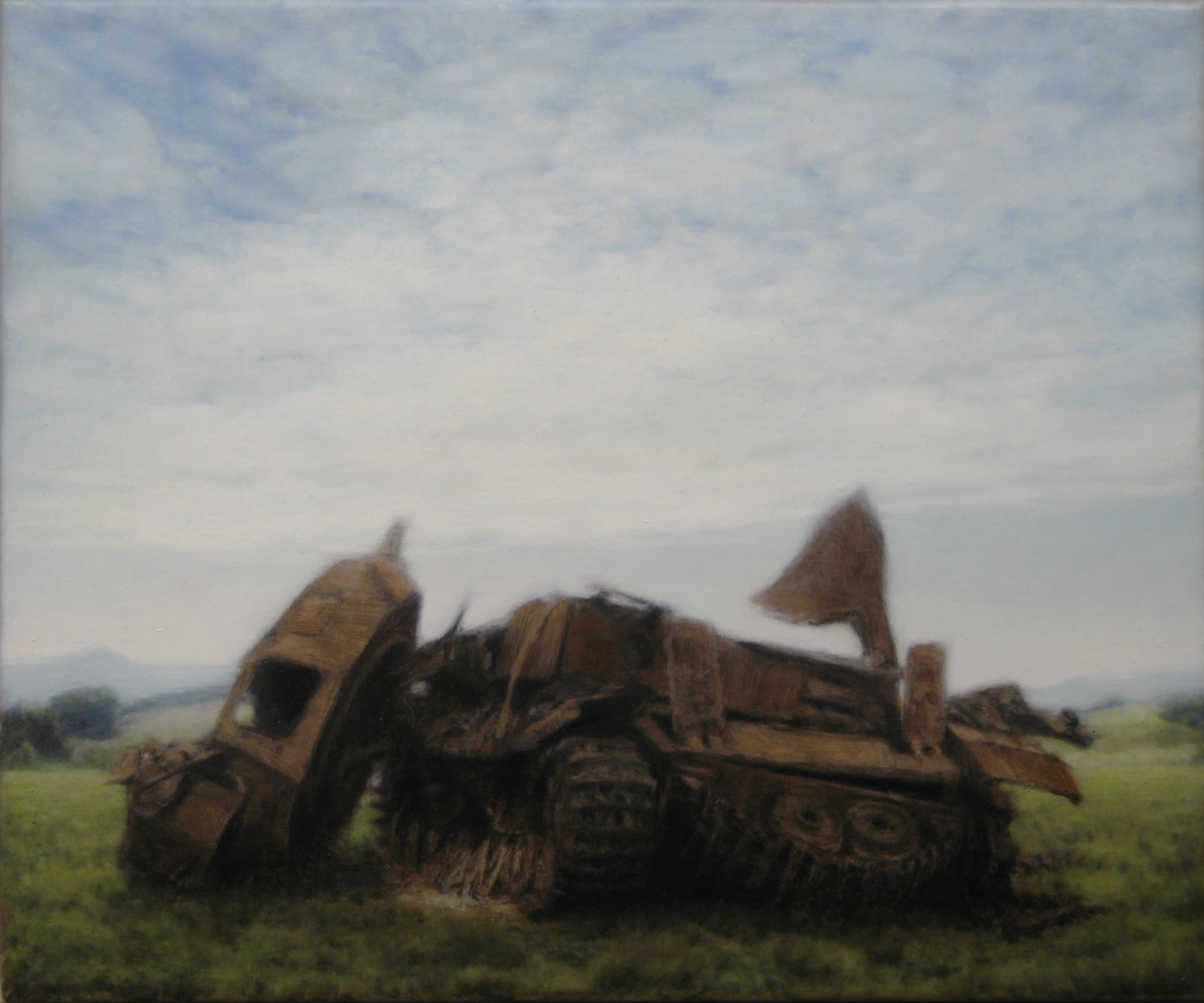
Wreck No.10


oil on papered canvas 31x25cm

At last, the first finished painting this year. There’s nothing subtle about the composition, but I’m quite pleased with the paint handling.

The wreck itself is done with streaky thin paint. It’s thinned with turpentine plus a touch of linseed oil, and the hard edges are cut back using a firm chisel-edged brush and turpentine. There’s very little opaque paint here, and what is there is thin and surprisingly orange (thin pale paint tends to go blue-ish on top of darks – something learned disguising glue lines in my antique restoration days).

I tried all sorts of oily paint/blending/glaze effects to get a strong light on the earth and sky, which may or may not actually be as effective as the idea in my head, and may be overworked. What is definitely successful is the overall contrast between the wreck and its setting – light/dark, light/heavy, soft/hard, and in this case oily/lean.

Just to follow up January’s post with SSA/VAS show: It was on during February and many good words were spoken about my pieces – by fellow painters – which was quite a boost, and it’s very healthy to have my profile raised a bit. The Union Gallery have also given me a huge boost of encouragement (which almost brought on a swoon), and some good advice about the gallery scene, which, with a bit of luck, may lead to more exposure.

All this positivity is all very well, but there’s a part of me (the greying mousy-brown bit) that suspects that it only came about because I am still blond from last year’s Punk Xmas.

Lord only knows what would have happened if I’d not been wearing glasses…

Saturday, February 4, 2012

Sunset


watercolour and gouache 19x14cm

In the National Gallery of Scotland there is a collection of Turner’s watercolours, which go on show every January. It’s been decades since I last saw them, so last month Madam and I went and had a look.

Lovely to see them again, and I hadn’t previously recognised the range of styles – from rigidly controlled pointillism to ethereal washed-out layers. It was interesting to see how good his drawing is, and that it underpins even the loosest of atmospherics.

This time, unlike my younger self, I actually read the information cards, which listed the techniques and materials used. There was ‘scratching’ and ‘gum arabic’, which flummoxed me a bit. The scratched areas were obvious, but apart from being the binder for watercolour, I couldn’t see why gum arabic was listed.

I’m quite keen on technical paint stuff, and searching the web for Turner’s methods, I found that he used gum arabic as a masking agent - Turner’s Techniques at the Tate - which was a bit unexpected, and there was more about adding extra gum arabic to standard watercolour, making it like a glaze (a bit like last month’s wallpaper paste).

The next time I was doing window work, there happened to be a sunset developing (the purist in me has a view that a ‘sunset’ is a bit of a cliché, and should be avoided). Nevertheless, I took up a piece of heavy paper and got going with the washes. And the gum arabic. And my trusty Swiss Army Knife. I liked using the glazy/arabic mix for adding to the ‘glow’, and the scraping was quite useful for regaining clean whites quickly.

While the drawing isn’t particularly accurate, I’ll just say that I’ve painted all the right colours - but not necessarily in the right areas…

Friday, January 27, 2012

Street Sketches


watercolour - figures 8-12cm tall

It is with some alarm that I realise that I have let my rapid figure-drawing slip. These are the best of a recent batch done since That Festive Period, and they really don’t match up to those done a year ago. I’m taking far too long to take in the figures as a whole, which means that I end up seeing them from different angles as they march past the window, which plays merry hell especially when drawing the legs. Which is annoying.

However, the one of the girl, on the right, is quite interesting technically. I’d been mucking about trying to do Japanese style woodblock prints (no results yet that merit a post) and this involves using a sort of wallpaper paste. I used some of this in the watercolour and found that it has a soft, evening-out effect within the washes - the opposite of the blotchiness of the figure on the far left. Neither is good or bad, but it’s a useful effect on the copy paper I use for these sketches.

Sadly, paste doesn’t improve the process of looking. There’s only one way to do this, and that’s to do more drawings more often, and looking harder. So if I do that, everything will be alright again...

Actually, I’m not all that bothered this week as things in general are going pretty flipping well alright, seeing as how I’ve just had two pieces selected for the annual Scottish Artists’ societies’ exhibition in the RSA*. That’s two years running now – very exciting. July’s Wreck No.5 is upstairs in the VAS* section, and last month’s Wreck No.9 is in the smaller SSA* rooms downstairs.

The show is on from Saturday 4 February till Thursday 1 March, and is a tasty addition to the CV. It’s usually an interesting exhibition - if you’re in Edinburgh, pop along.

So, despite feeling a bit miffed* with my drawing, I’m well chuffed* about the other thing...


* Initials and vernaculars
RSA – Royal Scottish Academy. Top Gallery in Edinburgh
VAS – Visual Arts Scotland
SSA – Scottish Society of Artists
Miffed – Slightly disappointed
Chuffed – Quite happy and proud. Full of oneself, possibly unbearably so

Sunday, December 25, 2011

Wreck No.9


oil on papered canvas 31x25cm

Just like waiting for a bus, there are none for ages then three come along at once.

The whole point of this piece was to produce a quick, loosely-painted, straightforward, beautiful landscape that I could maybe punt through a commercial gallery for money. No High-brow Layers of Meaning, no Art, no Big Ideas about the Human Condition, just a Sellable Pretty Picture.

Well, that idea started off really well, and - without any squaring up or preliminary drawing at all - I had the basics freely bashed out in an afternoon. I came back a few days later to tweak some shadows and puff up the clouds, and then it happened.

There I was, humming away, so pleased with myself, and it suddenly struck me that the painting was crying out for a wreck. It was irresistible, so there we are. The landscape is just as beautiful, the sky as innocent, but there’s now a hint of mortality. Those high street galleries will just have to wait.

Having finished all the works in progress that’s me relaxing for the Year End. No doubt I’ll be doing little sketchy bits over the holiday period, but I’ll start wrestling with the next batch of planned work in January. And just so that you know, I AM aware that I have to work faster.

But that’s me done for the year, so Cheeers…

Monday, December 19, 2011

Wreck No.8


oil on canvas 51x51cm

Hard on the heels of Wreck No.7, this piece is carrying on the idea first explored in Wreck No.6 in August – a section of damaged tank forming a ‘landscape’ beneath a sky. I’m still not convinced that the idea has legs, mainly because a landscape usually involves distance, and a wreck silhouette usually does not. We’ll see…

I was on the verge of abandoning this piece not long ago. I had doubts about my first cloud patterns and painted a very mixed, layered sky. Well, that lacked focus so I painted a great big rising cumulus in the middle, and that didn’t work either. Describing all the contortions I put that poor sky through would make very tedious reading, so suffice to say that I ended up utilising my original idea (the lower shining group) - but slightly smaller.

I think the tank element contrasts better than in Wreck No.6, and is a bit more suggestive of a dead thing. The damage is adapted from other images and not particularly exaggerated.

At the moment, the painting is hung in front of the bookcase next to Madam’s sofa. She has been lying looking up at it and seeing shifting shapes in the clouds.

Which is VERY flattering…

Friday, December 16, 2011

Wreck No.7


oil on canvas 91x91cm

I was just idly browsing for interesting landscapes when I came across a field with white cows. They struck me as being very pastoral and mysterious, and suggest a distinctly ‘Arcadian’ context. The wreck was chosen very carefully from my now disturbingly large library of destroyed tank photos. It doesn’t sit but seems to lay on the ground, and where the superstructure tilts towards the grass, the angles are similar to the cows’ tucked-under forelegs - an interesting rhyme across contrasting subjects.

I’m sorry to say that painting this was mostly very frustrating: I misjudged the tones of the sky and grass right at the start, and it took several corrections to get them as I wanted. As the cows were outlined fairly carefully in the setting-out, repainting the grass around them each time was a major chore. The light was to be quite subtle and I had trouble gauging the tones for a dull but luminous sky. I was grateful that painting the tank was pretty straightforward, and I have already written about the problems drawing cows in the previous post.

However, painting the middle and far distance was pure joy. I loved unrolling the landscape, and at times it seemed to paint itself. Not that it matters, but the wheatfields and trees are from France, and the valley and hills are Strathearn in Perthshire.

Though it was finished over a week ago, I’ve been working on this since summer, and a lot of music has come through the speakers since then. There isn’t a specific mood-setter, but I was listening to Shostakovich’s 24 Piano Preludes and Fugues a lot. If you’re tempted, here’s Keith Jarret playing No16 in B flat minor . This is the first version I came across and it got me keen to hear others. I usually listen to Konstantin Scherbakov’s - on Naxos - which I think is slightly more delicate but less available to link to on a blog.

I don’t know why but I felt very sad after having finished this, even though it’s quite a good painting, and I had to go for a big walk up the road. Often, finishing a piece is like the culmination of a hunt – having stalked it I’m chasing the painting and it’s twisting and turning trying to get away, and I’m getting closer and closer and then with the last dab and smear, I’ve got it. Signed and dated, Painter Triumphans.

This time I’d thought that I’d be relieved to finish it, but as soon as I had, it felt as though I’d just lost something.