Tuesday, January 31, 2023

Window Work – January 2023

6B graphite

I thought, for a change, that I'd dig out one of my larger, lumpier, drawing tools. These little sketches are all done with thick 6B graphite – 5.6mm leads in a chunky holder. This particular clutch leadholder is plastic, so not as heavy as some of the metal ones, but still feels very different from a pencil.

I had felt that I was getting in a bit of a rut with the Window Work and not concentrating properly on what I was doing, and I was open to approaching things a little differently. The catalyst for change was a gallery visit last month which featured work by Alberto Morocco. He was a highly respected Scottish painter, of the older generation that taught me at college, but I hadn't gone to the gallery specifically to see his work.

What struck me about the show was that it had a lot of functional drawing – there were sketches of musicians, obviously done in situ, and paintings that utilised them. Other drawings included written colour notes, in casual preparation for a potential painting at some later date. There were sketches of everyday things and people - fast, lean, and incomplete, but packed with relevant information. I was mesmerised by one of a donkey. It was in brown Conté crayon, a medium I'd used a lot at one point, and was just a few weighted lines - some doubled over in correction - and fingered smudges to suggest the roundness and weight of the belly. It couldn't have taken more than five or ten minutes, but was a good distillation of what a donkey is.

The experience brought me back very sharply to how I used to work – right down to the colour notes thing – and the casual everyday necessity of looking and drawing in order to find out how the forms of an object work. I was reminded of the distant early paintings I had done purely from sketches and colour notes (still got some – I should really photograph them sometime). I carried my drawing habit into the furniture workshop, and still have some of the job assessment drawings I would do when addressing what had to be repaired. This one is an Irish Chicken Coop Dresser. As usual with pine Irish Dressers chunks of cornice were missing, the bottom was entirely rotted off, and a lot of the glue dissolved after an overnight soak in the caustic tank to strip a couple of centuries-worth of paint off. (I also see from the notes that I was actually starting work at 9.30am, when I should really have been starting at 9am sharp. Oops...) A lot of this activity was swept away by the arrival of cheap digital photography, of course. The sheer convenience of capturing an accurate image in the blink of a shutter was always going to beat the effort of actually drawing for a few minutes.

Anyway, the upshot has been that over the last month or so I've renewed my keenness for Window Work. I increased my sessions from a very reluctant 20/25 minutes (during which I could barely sit still) to around 40/45 minutes and up to an hour - concentrating much harder on the 'looking' while allowing myself a bit more looseness in the mark-making (I quite enjoyed using the angled hatching to help the impression of form). In particular, I've been looking more closely at gait, and trying to work out what's going on with non-stationary legs. Really easy to do with a camera, obviously, but then you end up with a frozen image, which perhaps doesn't increase any understanding of the movements involved.

Which is sort of the whole point of the exercise...


Friday, December 2, 2022

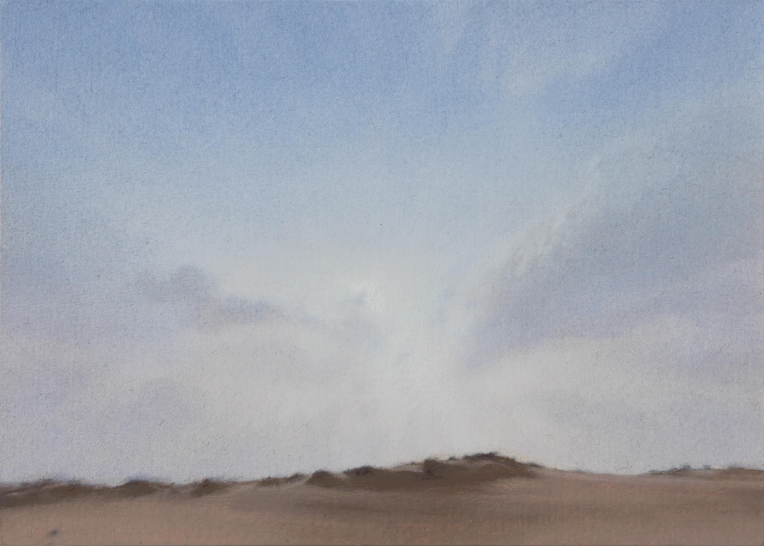
Sun – Oleshky Sands


oil on card 21x15cm

This is the third of the 21x15cm pieces for the Open Eye Gallery's 'On a Small Scale' show.

One evening a couple of months ago, I was looking at the satellite view of Southern Ukraine - an area of some intense news focus just now. I was intrigued by a huge pale anomaly on the south bank of the Dnipro River, just across from Kherson. Looking closer, and seeing the images available on streetview, I found this miraculous landscape – the Oleshky Sands. It's a sandy 'desert' - the dunes held together with scattered patches of rough grass, and peppered with clusters of random pine and birch. The local 'experts' have produced some very good quality panoramas for streetview, with some interesting skies as a bonus. Not surprisingly, it's a National Park, but - sadly - currently an occupied military zone.

The composition is all about the soft light, and the soft sand. The horizon from the original source image was levelled, the centre raised a bit, and the further landscape at the edges much reduced and simplified. The finished painting probably ended up missing the overall 'violetness' of the sky, but I did have a bit of fun playing with its underlying warm and cool undertones.

Technically, this was pretty straightforward. However, being fed-up indenting soft card surfaces when using crayon, the initial placings were done with a water-soluble graphite pencil. As I've just indicated, the sky is constructed with lots of thin layers. These are not true transparent glazes, but coloured 'veils' using semi-transparent Zinc White. The landscape was painted with mostly opaque pigments (e.g. Unbleached Titanium Dioxide – a usefully dull and opaque greyish beige), and the main sandy forms worked largely wet-into-wet. This was possibly an attempt to say something about the difference between solid earth and thin air by using contrasting paint qualities. Hmm. I have perhaps made the dune tufts too hard, and the atmospherics a little too fuzzy, but there we go.

I should expand more on the Small Scales show. It's basically a wide variety of top-notch painters' work on sale at reasonable prices. The show is exclusively online. My two recent pieces are up just now, and the gallery has added a couple of my unsold ones from past years. This painting - running very late – has been varnished and is in the gallery now, and may possibly be online by the end of this week - but the fourth of the pieces may not be finished in time to be included. I'm treating it as a work-out for a larger painting anyway, so nothing's lost.

Getting back to the graphite pencil, though. I'd seen some work where another painter had used water washes of graphite, and was puzzled, because in my experience graphite and water don't mix. Literally a couple of days later I was chatting with an old mate from college – an art teacher – who gently broke the news to me that water-soluble graphite pencils had been around for quite a long time actually. Which made me feel a bit silly. To cap it all, though, water-soluble graphite, on the primer anyway, seems to wash off with thinned oil paint as readily as it does with water. Which is not so good.

Hoping for better luck with my next technical breakthrough, whatever that's going to be...

Thursday, November 10, 2022

Mislaid Landscape

oil on card 21x15cm

This is the second postcard-sized picture for the Open Eye Gallery 'Small Scale' show. There's some music associated with painting it, though not as a mood-setter. While working on the last stages I was listening to Radiohead's first album, 'Pablo Honey', and this happens to be the first track. Very refreshing. The whole album – which includes their breakthrough single 'Creep' - is quite raw in comparison to what they went on to produce, but you can hear where they're going.

The original source image was a screenshot grabbed from google streetview. Unfortunately I have absolutely no idea where this landscape is. This is annoying, a) because I wanted to use more information from the surroundings when composing the picture, and b) to source more material with that light and landscape. The screenshot was taken when I was under the mistaken impression that the global coordinates were still being displayed (a practice discontinued some time ago). I now make sure that I have a record of a landscape's location and time, and that I can find it again. This one's got to be European, but whether it's Western Russia, France, Poland, Sweden, or Lithuania, is beyond me.

(My current method of recording a location: Once in streetview, go to the little info box in the top left corner. Click the 'three dots', then click 'Share or embed image'. Either copy that on-screen link or take another screenshot of it).

What I liked about this setting was the saturation and freshness of the colour and light, and the way that while the shorter trees of the group were still, the tall birch was being made ragged by quite a strong and very local gust of wind. This tree also seems to lean into the wind, which is even more interesting. The only compositional tweaking is some cropping of the source image, and some repeated and reversed copy-and-pasting of some of the original foreground grass, to hide some road surface in the bottom right corner.

Colour-wise, I've used a fair bit of Cadmium Lemon in the greens to boost their intensity – a step up for me as my palette is usually fairly muted. In terms of paint handling, there's quite a lot of scratching into the wet paint in the foreground grass, and – except in the clouds - I refrained from mass blurring and softening with fan brushes. Until the last session, that is, where I had to correct some jarring and misjudged final darks in the trees, and blurred the lighter opaque greens over these hard-edged miss-steps. I wish now that I'd softened some of the red-browns of the trunks and branches – transparent glazes over the plain white bark - but there you go.

This little painting probably took too long and may still be too rough, but I did learn something about widening my range of marks. Whether that gets carried forward is another matter, but all-in-all this was a useful piece to have got done. And despite being a little angsty about the trees, I'm actually quite pleased with the softness of the sky. It feels very calm.

Which is nice...


Thursday, October 20, 2022

Sky - Lipovka

oil on card 21x15 cm

This is small postcard-sized piece, the first finished of my contributions to the Open Eye Gallery's annual Small Scale show. And I'm pleased to say that its painting went quite well.

There's no particular music associated with this, though I did do a lot of catching up with Melvin Bragg's 'In Our Time' programme from BBC Radio 4. (There is so much of interest to listen to there – explore the Archive, you won't regret it) Having said that, during the final easel session – when I was hunting the painting down, and where everything fell into place – I listened to Reinbert de Leeuw's recordings of Erik Satie's piano pieces (like this one). Which connected rather pleasantly.

The source image was a fairly random but lucky find when free-roaming through google streetview one evening. It's a view from a Russian motorway – the M-4 - just north of the Lipovka turn-off.

Compositionally it's all about the sky (of course). The supporting landscape was flipped left/right and a little reworked, the distant hills have been enlarged, and I've shifted one of the cumulus to the right a bit. I'd taken the original screen shot probably about seven or eight years ago, and - failing to do anything with it - carried it forward year by year in my 'Cloud Studies' folder. When I finally got round to developing it and needing more info about the wider context, I found – to my horror – that I had no idea where this was. I had to go back to my original screengrab files and look for clues there. I found that I had, luckily, taken another screen shot some minutes down the road, which included a map view with a place name. As this is the only motorway in that locality, I simply tracked up and down it till I'd found the original location AND the right date. Streetview has now gathered so many shots of locations at different times, and on both sides of the roads, that it can be a bit of a jigsaw now, and the available source dates can change within yards. It is a fantastic resource, but it can be annoying when trying to trace a particular view on a specific date. I did find it though – eventually - and such was my rejoicing that I was close to making the title 'The Prodigal Sky – Lipovka'.

There's nothing unusual technique-wise here – spot grids, basic crayon drawing developed lightly with Paynes Grey fluid acrylic, then oil layers. Annoyingly, the spot grid crayon had rather pressed the card and made little indentations. They're not particularly deep, but could have gathered concentrations of paint where not wanted, so I may have to re-think using crayon on the relatively soft card surfaces.

All in all, I'm pleased that I finally got to grips with this image, and I think I've made a good enough stab at the higher altocumulus masses. Madam said that the lower cumulus clouds really do seem to hang in the space. Which was nice.

I should just say: The date of the source image is June 2013, and all is well. It is the main arterial road from the Moscow area to Rostov on Don, and eastern Ukraine. I have no doubt that the traffic on it just now – night and day, in both directions - is grim, deadly, and tragic. This present will become the past. And whatever sky is there today will be replaced by another one tomorrow, and constantly be wonderful.


Monday, August 15, 2022

Overcast – South Queensferry

oil on card 30x20cm

There is some music to go with this. Energising by playing pop and rock singles wasn't working, so I returned to back-to-back Richter for a change, and 'Infra' and 'Three Worlds: Woolf Works' got me back in the right zone. 'Infra 1' heralds the whole album's general swell and relax, which seemed to work with the soft lens shapes in the cloud, and the rest of the music got the steady brain rhythms and concentration going – which always helps.

The source image is another (quite old now) snap from a train window, looking west. The location is between the two converging railways lines just south of South Queensferry – the other track is behind the lower line of trees across the field. At the time, the Winchburgh tunnel was being worked on, and my usual train had to be diverted north towards South Queensferry, where it waited for 5/10 minutes before rolling back south on the other line to rejoin the main railway further on. The two tracks enclose an isolated pastoral enclave; a small triangle of lush grass and reeded ponds bordered by industrial units, a chemical store, and motorways. There were usually sheep there, munching away, un-phased by the modern world swirling around them (The M90 is just behind the ragged tree-line in the centre – I've 'disappeared' its tall lamp posts and gantries). This shows where the train was when I took the photo.

I was actually searching for another landscape source I have; a similar foreground of shrubs under a much more dramatic sky, but I came across this forgotten photo first and just went with it. (I'll find the other one at some point and work it up).

The sky here, in this source, was quite dull and overcast, and not even dramatically dark. I kept it that way, and it was interesting making something interesting out of something quite bland and ordinary. The painting is almost a straight lift from the source, the only changes – other than removing the lamp posts - being some shifting of the bushes and a levelling of one end of the field.

Technique-wise, I decided to break with the last few years' usual tight grid placing. The careful pencil/crayon, and acrylic under-drawing went out the window too. I placed the initial picture elements in thin oil paint without a grid of any kind (a sliding card strip proportional method I used to use which I promise I'll explain at some point, but please, not now). I have to say it felt quite good and safe at this size, though for me, painting anything any bigger would really require a safer grid of some sort. Anyway, while this piece didn't quite paint itself, it didn't resist too much and I allowed myself quite a lot of freedom to play with the paint and to take my time over it, so it was actually quite enjoyable to do. Having said that, I did manage to wipe away half an afternoon's work by mistake (it wasn't as dry as I'd thought it was, obvs), but it didn't really matter, and the shrubs look better for the extra work anyway.

I should also mention that I returned to my Fake Flake White for this one. I'm sure I've covered it before but it's worth a repeat mention – if just to remind myself not to forget it again. I was checking through photos of past palettes, (yes, I photograph my finished palettes, with all the colours noted. Sorry about that, but it's quite useful sometimes) and it seems that for some unexplained reason I simply just stopped using the Fake Flake towards the end of 2019. It does actually feel a lot like Ye Olde Lead White, though, and isn't completely out the park price-wise. I've also been using some new synthetic hog brushes, and the pointed rounds are astonishing. They retain their shape beautifully, have a very responsive point, and are very pleasantly springy. It'll be interesting to see how they wear.

Still on the technical stuff, I'm quite pleased with the sky. It's done almost completely with Fake Flake White and Ivory Black, with Walnut oil added. The Walnut oil makes the paint very mobile and quick - very suitable for horizontal stroke blending - as opposed to stipple blending - for which I find a sticky Stand oil mix more suitable. The greys were applied with my new synthetic round hog in soft linear, almost hatched strokes, then blended together with soft fan brushes. I built up the sky gradually over several sessions to get restrained tones and a very soft and gentle surface. Admittedly, that surface did gather a bit of cat hair on the way - it's unavoidable in this house - but nothing too major.

Summing this one up, I'm happy with the painting, but the process itself felt quite good for a change, and was a boost to the confidence - possibly what I was looking for at the beginning of the year. The shift in attitude, technique, and to some extent materials, was definitely a positive one.

Oh, and I've got a new bike as well. Which is nice...


Tuesday, June 28, 2022

Sheep Studies

pencil

These are a few sketches of sheep, though more accurately they are studies.

Why sheep? Well I've got a couple of things on the go just now which, coincidentally, feature sheep. Not having ever drawn a sheep in earnest, I found that I hadn't a clue what makes a sheep look specifically like a sheep – as opposed to a goat, a cow, a dog, or a very small woolly horse. Of course, I've got my sources for the paintings, but I felt I needed to know more about their general characteristics.

Why studies? It's one thing to recognise something, but another thing entirely to reconstruct it so as to read back correctly. The eye has to find out and inquire what makes the subject recognisable, and the best process for that is drawing it.

Not having convenient live references nearby - there haven't been sheep on nearby Arthur's Seat (just a mile away) since 1977 - a quick google image search supplied flocks of them to choose from. As expected, the initial results were pretty ropey, but I was encouraged to see that the effort was rewarded. The lower, later sketches are – if not quite the full Rosa Bonheur – indisputably of sheep

And, no, I wasn't counting them...


Monday, May 23, 2022

Three Crows

oil on panel 31x25cm

There is a music track associated with this – it's 'Opening' by Philip Glass. I played it as I was starting the oil layers, and its cold relentlessness seemed to fit the mood.

I snapped the source landscape for this piece a while ago from the Crieff bus, but it hadn't sparked anything worth following up until I was looking for ideas in late February - around the time of the invasion in Ukraine. Seeing it again while flicking through old photos, both the movement sweeping across the landscape and the Gothic crow shapes in the trees made themselves apparent, and suggested a dreadful wind. I leant all the trees to the right to show that, and introduced the trio of crows on the left. In the trees, the beak shapes were switching about during the painting process - sometimes one, sometimes more, like infant birds screeching in the nest. It's a very odd experience when a shuffling of factors brings sudden relevance and recognition to the previously passed-over and disregarded.

This is on a panel prepared some eight years ago which, luckily, I had forgotten about. 'Luckily' because I hadn't organised any surfaces to paint on during my down-time, and had felt work coming on again. It has a grey oil primer – near exactly the colour and tone of the distant low clouds, which have just the barest touch of paint on them. This ruled out any acrylic under-drawing, so objects were placed with crayon then developed directly with oil paint. I also used a different oil medium mix - Stand Oil with an increased proportion of Damar Varnish. It's very sticky, and quite unsuitable for painting large areas evenly, but it's very nice to work with on a small scale.

For some reason I found it very difficult to arrive at the final tonality of the near grass and especially the 'real' crows. They are quite finely drawn (aided by a magnifying glass) and were at one point almost jet black. Their combination of sharp, focussed marks and black tones hooked the eye so quickly that I dulled them down - I now much prefer them almost hidden in the weeds. They're quite rewarding once you see them, but the down-side is that I fear the casual viewer will just stroll by the painting without bothering to look too closely. However, I'm not sure that I'm prepared, at this point, to do anything about that.

On the positive side, I enjoyed doing the sky, and didn't feel too constrained to adhere rigidly to the source material. It's rather bleak and chilly but has some luminosity, in contrast to the umbrous and murky landscape.

Which pangs my heart given the painting's genesis.


Friday, April 29, 2022

Window Work - April 2022


watercolour

The blog returns after a spell away for rest and recuperation. My work book logs it as a single page saying 'Break – Time Off – Art-free Zone' between Xmas and the last week of February.

When I did return to planet Artwork it was aboard the good ship Window Work (of course) but I was horrified to discover that my drawing muscles had withered somewhat. My touch was clumsy and slow, and I was way, way, out of practice at looking. After much unrewarding labour at the window, I think I've got some of that fitness back, and now, occasionally, my fast sketches aren't too bad. I quite like the linear efficiency of the 'backpack girl' at the upper right, and the liquid blobs of the gulls.

That apart, the normal routine has resumed. Compositions have been worked out, panels have been made and primed, and two easel pieces are currently on the go, with a third awaiting its turn. I did have a slight setback though, as just having finished the panels, I had quite a severe 'tweak' of the back. This made standing at the easel difficult for a few weeks, and for a while I was restricted to – window work! However, it's well on the mend now, which is really rather nice.

Finally, out in the wider world, I have a painting (Herd – West Lothian) currently selected and hanging in the RSA Open show - in the 'Greek' building on the corner of The Mound and Princes Street, in Edinburgh. It's downstairs in the Lower Gallery, and, along with the entire contents of the show, is online as well.

Nice to be back...


Tuesday, January 4, 2022

Oryol

oil on card 21x15cm

This is the very last piece from 2021 – completed for the still ongoing 15x21cm Small Scale show.

There is a piece of music to go with it – JS Bach's Prelude and Fugue: No. 1 in C Major, BWV 846, but really more the fugue (starting at 1:58). The prelude is fairly simple and straightforward, like my initial idea of how this piece would go, but the fugue then plunges into a delicate maelstrom of complication, as the actual painting rather unexpectedly did.

This tiny landscape and sky is sourced directly from google streetview - the land forms broadly unaltered, while the sky was opened up a bit with a little photoshop fisheye distortion. This setting - near Oryol, in Western Russia - had originally been reserved for a larger painting with a figure, but I decided to use it as a small scale piece to save me the time of sourcing and working something out from scratch. Half-way through painting it I suddenly realised that there should have been an eagle up in the sky – probably in the upper left - as 'Oryol' (Орёл) is Russian for 'Eagle', and that would have completed the pun. Impossible at this scale though. Maybe another time.

Technically this followed my current standard initial procedure – crayon for spot-gridding and landscape placing, then thin fluid acrylic for landscape tonal grisaille. The main sky forms were placed in thin oil, and the whole built up with oil layers. I probably could have developed the opaque/transparent work in the sky a lot more, but I felt very much under time constraints to get this finished. As it is, it's more like a watercolour than an oil painting – which is fine – but I feel that this had the potential to be a more interesting piece.

To add to the already quite high tension, I completely mucked up the varnishing, resulting in a thick wrinkled splodge along the left centre of the sky. So it all had to come off. The final paint touches had only been left a week to cure (a perilously short time), and I was terrified that the varnish's white spirit solvent would take some of the paint off too. A clean white muslin cloth was laid flat over the surface, evenly sprayed with white spirit, then overlaid with a sheet of thin white bin liner. After about ten minutes the varnish re-liquified (as it's designed to), and the cloth was carefully peeled off. That brought a lot of dissolved varnish with it, and, miraculously, the paint was undisturbed. The remaining wet varnish was removed lightly with rolled cotton wool swabs (like real picture restorers do on the telly) and small muslin cloth pads, all with no sign at all of any colour coming off. A couple of subsequent (very light!) sprays of varnish next day went on perfectly, with no beading or irregularities at all. Phew.

Incidently, a more basic plastic sheet & solvent technique – a methylated spirit soak under a black bin bag, then wiping off the old paint with paper towel or ultrafine steel wool – is excellent for cleaning used palettes. Meths softens both dried oil and acrylic paint, and this method saves a lot of dry scraping, though I'm not sure how this works with Alkyd resin based products or mediums. (I've been wanting to shoehorn this little nugget into a post for ages.)

All that tension with the varnish apart, I did enjoy the freedom I allowed myself in the sky. It might be rewarding to develop ('indulge in'?) that a bit more. We shall see.

However, I will be taking my time about getting back to the artwork. I'll be aiming - as far as possible - to be driven by creativity rather than time-table, and I'm not planning on having anything done this January. This first post of the new year is carried over from last December purely for the sake of a bit of continuity.

Which reminds me – I hope that 2022 is a more positive and 'straightforward' year than the last two have been. Not just for me, but for everyone out there, whatever you're doing...

Tuesday, December 7, 2021

Low Blue - Huntingtower


oil on card 21x15cm

I needed a fast, uncomplicated small composition for one of my Open Eye Small Scales (21x15cm), and this really fitted the bill. It's a composite of a couple of snaps taken a minute or so apart along the A85 westwards from Perth – the sky and right trees from east of West Huntingtower, and the left trees and landscape from west of West Huntingtower (a small village near Huntingtower Castle).

I don't actually remember the composing bit, but I think I threw the two sources together fairly rapidly and quite possibly late at night. I seem to have mistakenly deleted the series of composition files made putting it together – which is annoying.

This is the first painting I've done in a while using a grey primer. It seemed a very good idea as the piece had to be done very fast, and was going to be quite dark overall anyway. I had seen that Michael Harding had introduced a new grey acrylic primer so, this was an opportunity to try it out. After the initial setting out and quite a cursory fluid acrylic development stage, a lot of the oil paint was opaque right from the start. The initial landscape mixes were Oxide of Chrome Green, Mars Black, and Unbleached Titanium Dioxide – all very opaque pigments. Likewise the sky was built with Titanium White onto the grey priming, with tints of blue and modifying thinner patches of whites and dark greys. The low blue band was a few finely-stippled and increasingly dense layers of semi-transparent, Damar varnish heavy, Ultramarine and Zinc White mix.

The grey primer was a pleasant change. It's very densely pigmented, covers easily, and is sold as being very non-absorbent – so that oil colours won't go flat when drying (I didn't notice any difference to be honest). What's very interesting is that instead of using chalk for its filler it uses marble dust, so it has a very fine but quite definite 'tooth' to it. Not that that was a particular plus for me – I like a smooth, nearly polished surface – but it's interesting to notice it.

If you think you've heard the name 'Huntingtower' before, it may be because it's the title of a novel by John Buchan. I can't say I've ever read the book, but I did hear a very enthusiastic BBC radio drama adaption years ago, which might even have been in stereo.

There's really not that much more to say about this one except that it was quite efficiently done, and that I took a great deal of pleasure in exaggerating the Low Blue band above the skyline.

That's two Small Scales now in the Open Eye. The online-only show has been up on the website for a while now - nearly three hundred at a time – and I expect mine will join the rotation shortly. Once my third one is finally finished and delivered, I'm going to take a break for a few weeks, or more, to recharge my drained-out ArtyBatteries.

Meanwhile have a good Festive Holiday and New Year. I hope we all have better times and fewer worries in 2022, and that the Greek Alphabet remains as obscure as it always has been for most non-classicists.


Wednesday, November 24, 2021

French Mist


oil on card 21x15cm

This is the first of my three contributions to the annual Open Eye Gallery Christmas Small Scale show – all pieces being 21x15cm. It's a composite of two locations, not very far apart, in the Pas de Calais. The sky and the central wood are from near Longuevillette, and the more distant features are from further up the road. The landscape is very typical of the area, but I wanted to fix it unmistakeably in France, so – short of erecting a flagpole and raising a tricolore – I plonked a yellow Citroën 2CV in the field.

Technique-wise – the sky involved much atmospheric stippling (with a thinned Stand Oil medium), and a lot of fine fading on-and-off with a small cloth-covered pad. The tiny car was, while not a nightmare, quite tricky to do - needing close work with a fine pointy brush and magnifying glass – but I think I've got away with it.

I'm absolutely not a car buff, the 2CV – or 'deux chevaux' – is instantly recognisable, even to me. It's a classic, akin to the Volkswagen beetle, and mass produced at about the same time. Like the VW Beetle, it was designed as an affordable popular car for the masses. However, as France is a largely rural country the 2CV was designed primarily for getting farmers and their produce reliably to markets along country roads and rough tracks. One design criterion was that drivers should be 'able to transport eggs across a freshly ploughed field without breakage'. The car was produced for over forty years from many different factories – including one in Slough, England. Indeed, the Royal Navy bought some for the Marine Commandos – the 2CV being light enough for helicopter transport and robust enough to cope with jungle tracks (I'm assuming during the 1950's Malayan Emergency). Which surprised me.

I had meant to draw a line under the Open Eye show quite firmly this month. That exhibition, with nineteen pieces in total, is done now (two of the small sky paintings sold. Which is nice, but could've been better) but such was the unusually low footfall that the gallery are giving the November painters (Tom Mabon, Paul Barnes, and myself) a combined extension in the back room for December. There will be fewer paintings each, but I'm certainly not complaining.

There was also an unexpected addition to the show in the form of a poem, written by Morna Burdon. She's an actor, writer, poet, and director, who is also one of our upstairs neighbours. I'd invited her along on the first Saturday, and she wrote this poem about the work and being in the gallery that afternoon. I thought it was marvellous. Here it is, titled and signed, and spaced as in the original -


A response to the exhibition by artist Keith Epps – Open Eye Gallery, Edinburgh 30th October 2021. 

White

Clouds

Palette blue skies

perfect
distractions

Idyllic geese
A dog alert and innocent
Arles-like fields of hay
Gentle moss green trees
A dead child

No time to catch breath
To turn away
Upper body casually displayed
Disturbed
dismayed
At this calamity
On to the warm calm of gentle yellow fields
What harm could....
But then it does
There
         There
And there again

We
They
We
They
Stand
Speak
Laugh
Enjoy
Incline
Examine the cost
Drink blood red wine

Within pure white walls
Soldiers trudge
Contentedly away
From rape and pillage and death

A parcel
Wrapped in crushed brown paper
Tied with light beige 
String
Secures a happy exchange
Lips red
And smiling
And pleased

The clouds darken
The child's body flops once more
From beneath the protective shadow of the guilt-filled hedge.

Outside, the sun shines 


                                                                                          MORNA BURDON, NOVEMBER 2021

The gallery thought it was wonderful, and had it printed out and put on the wall. The 'child's body' refers to the figure in 'Landscape with Shadows' (which was added to bulk the show out). She really gets what the paintings are about, and I think the poem greatly added to the room.

Which has taken us a long way away from a car in a misty field in Northern France.


Friday, October 29, 2021

Herd – West Lothian

oil on panel 75x45cm

This is the final painting for the Open Eye Show. It's another view from a train, of Binns Hill - just East of Linlithgow.

The sky is broadly as in my original photo, but the landscape has been flipped left to right - enabling an upward sweep across the panel. A dark cloud moving in from the left was painted out, and the wooded rise on the right is invented. The dark cloud was replaced (I couldn't get away from it looking like a pointing hand – which looked ridiculous) with some vague altocumulus clouds from elsewhere and the second rise is a selective cut-and-paste from the left hill, woods and all. The landmark tower has been disappeared.

The cows were in the original source photo too, but they have been multiplied, shifted, and rearranged in order to gather interest towards the left, and fade interest towards the right. The tiny figures behind the wall are taken from photos of American gangland murders – difficult to source and select, but a lot easier than wading through swathes of atrocity images.

My initial intention was to construct the sky with transparent layers on the white priming, while the landscape features were to be drawn in black fluid acrylic, then semi-obscured by a mid-grey layer which would kill off the white priming. That plan went off-course fairly quickly. While the landscape plan worked – quite well, actually - the sky went very thick and very murky very quickly, and I lost control of the cloud forms. This necessitated an even, semi-transparent, white layer over the entire sky, and a rebuilding of the cloud forms in grey monochrome, with final blue tinting overlays. The whole thing, frankly, turned into both a bit of a slog, and a race to get the damned thing finished in time to be dry enough for the show.

I think it's turned out all right though, and there's a nice soft glow to the sky, but a special mention has to go to the cows. There are sixteen full cows here – seventeen if you count the half-obscured one fifth from the left. Drawing cows that look like cows – and not like horses or pigs – is tricky at this scale, and I think I've done quite well here.

This painting was actually finished on the 27th September but I've deliberately delayed posting this blogpost in order to include some post-production, pre-delivery stuff. The most important of which was the varnishing.

This was somewhat fraught due to the fact that my preferred finish turned out to be unobtainable in the uk. All Winsor & Newton's production is done in France now, so I presume there's a container full of W et N's Professional Satin Varnish Spray just sitting in a lorry park somewhere. I managed to stumble – in rising cold panic – through a series of sprayed and brushed-on gloss varnishes, finishing with a couple of light modifying layers of an unknown brand satin spray. The finishes aren't too bad I think, with only a minimum of cat hair in the brushed-on layer, and you would never know that I had managed to scratch (stray fingernail), and then fix, two of the paintings in the process. Not saying which ones.

Pre-show tension is a strange phenomenon, and this time it manifested itself in my being locked into two random previously-unknown songs - Richard Thompson's 'I misunderstood', heard on the radio, and Brandi Carlile's 'The Story' off the telly. I simply couldn't get them out of my head – especially the latter, which I actually dreamt about after the first hearing. This is not the first time this sort of thing has happened – prior to the show two years ago I had a trapped song fragment going around my brain. I hadn't a clue as to what it was or where it had come from – I still don't - it just filled my head. At least I could identify these two, and they were actually pretty good. Which was some relief, and make of that what you will.

Anyway, all the paintings ended up safely wrapped (only just - the very last bit of my roll of bubblepack, right down to the cardboard core, was exactly enough for the last two small pieces!), and we carefully taxied them down to the gallery. The day after that my watch stopped, the battery run down. Phew.

So, as if any regular readers needed reminding, the show is at the Open Eye Gallery, on the corner of Abercrombie Place and Dundas Street, Edinburgh, until 4pm Saturday 20th November, and is on-line here. Those wanting to visit should be aware that numbers within the gallery are currently restricted to between eight and fifteen, and face masks must be worn.

Madam and I just back from having a sneaky look today. They've done a smashing job hanging it, the show looks great, and it's been boosted with just a couple paintings from the last show. Which is fine, they deserve a second shot

If you're coming along, my show is in the room on the right as you go in, but make sure you take in Tom Mabon and Paul Barnes' work while you're there.


Wednesday, September 29, 2021

Ruigendijk

oil on card 32x20cm

There is some music for this - it's Glenn Gould playing JS Bach's Goldberg Variations. I hadn't played it for a while, but I put it on while laying down the initial placings. I listened to it a few more times during subsequent work sessions, and my last touches on this painting were placed just as the final Aria repeat finished. Which was very affecting.

The source images for this little painting – via google streetview – are from a short stretch of road called Ruigendijk on the island of Texel, off the Netherlands coast. I'd played around with this sky and location years ago, but this time finally got around to making something worthwhile. The sky is virtually unchanged – just the small top right cumulus shifted left a bit - but the landscape uses features from several viewpoints, copied and pasted, flipped and stitched, and generally juggled about to make something that works.

This is definitely a painting of two halves. In the sky, the paint is soft, and finely faded and blurred. On the landscape it's much more energetic (for me!), and the brush marks, streaks, and scratches are largely left alone to do their thing - I think I was trying to convey the energy of the wind coming in across the North Sea. While this one didn't quite paint itself, it was very compliant indeed, and I think I'm quite pleased with how it went.

A little more about the Goldberg variations. They were commissioned by an insomniac Russian ambassador to the court of Saxony, and were written for his harpsichordist – Goldberg - to play when the gentleman couldn't sleep. The whole story is best read here. I have to say that they suit the piano a lot more than their original instrument. I'm sure that Herr Bach would have used the piano had he been able, but unfortunately he had yet to see and play one. Glenn Gould recorded these variations twice – in 1955 and 1981. This is the second, magnificent, 1981 recording. If you can hear humming, it's Gould himself – he had a compulsion to hum along, and no engineer was successful in blocking that out. It's about fifty or so minutes long, and is basically thirty very different treatments of the opening theme. It's worth listening to in full at some point, though preferably not on scratchy vinyl interrupted by the odd youtube advert. I'm pretty sure this recording is on Spotify and Amazon etc.

Finally, exhibition news. The last panel painting has just been finished, so now it's make sure, or rather hope, that everything's dry enough to varnish a week or so before they leave the house for the gallery. The exhibition goes 'public' on Saturday the 30th October, till the close of Saturday 20th November. It's already up on the 'Exhibitions' page now – with fellow landscapist Tom Mabon. There won't be a formal all-comers Preview – with wine and much back-slapping (or should that be the other way around?) - but I'll try to make a point of being about the gallery on the Saturday, or in the 'New Town Fox' eatery across the road - nice cake there if I remember rightly. Again, the show will be at the Open Eye Gallery, Edinburgh, and here's their website with all the details you might need.

Oh, and if you're coming along, remember to bring a face covering...


Thursday, September 16, 2021

Zaytsevo

oil on card 30x20cm

That's the first of the last three pieces for the fast-approaching exhibition done. It was finished last week as it happens, but as blog posts are second priority at the moment I've left writing it till just now while the surfaces on the other two are settling.

The source image for this piece is of, course, from google streetview. It's just outside Zaytsevo - a tiny village at the end of a bus route - in western Russia. There has been much alteration and divergence away from the original source. I've levelled the valley, removed the road, shuffled the trees around, and given the landscape a completely different sky. What looks here like a solid clump of trees is in fact the front end of quite an elongated wood. I suspect that there's a spring in the middle there somewhere, possibly even a small pond. Further away in the distance, there are pale circles in the ground which I first assumed were exposed soil or sand. Surprisingly, they're actually round patches of a different grass. I can't imagine how that came about.

I'm very happy with the blue of the sky in this one – a first thin layer of Ultramarine and Prussian Blue, then a faded layer of Ultramarine with a touch of Paynes Grey towards the top. I'm still a bit hesitant about cirrus clouds, I should probably try to be a bit more relaxed about them, and enjoy them more. Cirrus clouds remind me of some of the marks made by professional decorators when graining and marbling. I did quite a bit of that when in the antique trade – making sometimes quite sweeping marks with ragged brushes and torn cardboard edges. The really good stuff is done using goose or swan feathers, but I never got the hang of that.

I was quite good at painting rosewood and satinwood though – just as well, because as the Edinburgh New Town developed, a lot of Georgian and Regency furnishings suddenly had to be built to fill it, and, centuries later, I had to fix and refinish quite a lot of them. Not everyone then could afford actual rosewood or satinwood (the trendiest timbers of the period), so the doors, panels, and chairs etc were made of pine, beech, or birch, then painted to resemble the classy stuff. Grained and painted furniture became quite a trendy thing across Europe in the late 18th and early 19th centuries, and again in the 1980's (luckily for me). When the Director of the Scottish National Gallery re-fitted the Gallery with antique furniture he bought a fair few pieces from a dealer I did a lot of work for, and some of those console tables and chairs in there were restored and finished by yours truly.

That little tangent apart, this piece generally went quite well but had a rather frantic last session – a final blue tint glaze over the foreground went on too heavily, and I had to frantically take it off with paper towel and clean soft brushes. Luckily, I got most of it off while not removing too much of the lower layers. Phew...

Right, exhibition update. The show opens to the public on Saturday 30th October till Saturday 20th November. I'm not up on the gallery future show list yet, but best keep an eye on the Open Eye Gallery website for developments. More news next blogpost...


Thursday, August 26, 2021

Window Work – August 2021


watercolour and pencil

Window Work again I'm afraid, though for a good reason. More about that further down

Meanwhile, here we are with some live fast drawings. Despite my dip in success rate recently, I think a couple of these are quite good. I particulary like the pencil sketch of the old chap under the umbrella and his hatched tonal indications. I quite like the sheer economy of the marks in the very foreshortened person seen from above – there's just enough to let you know what's going on.

I'm breaking my pattern of work for the next couple of months. Instead of working towards having a finished piece each month, I'm aiming to have the three I'm currently working on finished by the beginning, or middle at the latest, of October. The reason is that I've got a show opening at the end of October for November - at the Open Eye Gallery, in Dundas Street in Edinburgh. That's the same gallery where the last one was in September 2019. I don't want to rush these three at this point – it would be much wiser to get them done well together, rather than finished serially just for the sake of a self-imposed arbitrary timetable.

I'll give out more details about the show in the next blogpost. It looks like the Covid is on the prowl again in Scotland just now, and there is a possibility (remote as I write, but these things can change quickly) that some restrictions could be re-imposed, and that could impact on how to visit the gallery to see the show.

Fingers crossed for a live – and unrestricted – exhibition...