Saturday, December 31, 2016

Four Figures and a Canine

watercolour

It’s been a while, so here’s the cream of the Window Work done since April. 

To be honest, I don’t think I’ve been particularly diligent in my pre-easel warm-ups lately, and I’ve maybe been ‘going through the motions’ a bit. I quickly realised this when going through the drawings pile and saw that most of them really weren’t up to scratch (cue extra sessions and renewed concentration over the last few days).

As usual, they are done with the usual Paynes Grey watercolour on 80gm office A4, but you might notice a change of brushmark amongst them. My Pentel Aquabrush – which I felt I’d better get used to a while back – has become quite blunt and difficult to make fine marks with. I was still using it for the heavy metal guy, the dog, and the girl on the right, but the other two figures – done over the last couple of days – are done with a new, sharper, watercolour brush. If you compare the half-man and the dog sketches – both about the same size - you’ll see that his marks are pointed and quick, whereas the dog’s are rounder, softer, and a little less precise. The worn Pentel Aquabrush has been put aside for now - and that has absolutely nothing to do with a bad workman blaming his tools.

It’s the end of 2016, and – artyworkwise - it’s been quite a good year for me. I’ve been selected for both the SSA and RSA Opens, and have had work on show at the Union Gallery. There have been some sales (I have very mixed feelings about that but I’ll move swiftly along) and people have said some very nice things about the work, which is always very nice to hear. Looking forward, I’m wanting 2017 to be calm and placid - with no external excitements and tensions - so I can a) finish the stuff I’m working on just now, b) get on with the stuff I’ve already got lined up, and c) think up more ideas (the scary bit) without being unduly distracted by ‘events’. And I wonder how that’ll work out.

No more to say really, so that’s it for 2016. A Happy and Healthy New Year to all when it comes…

Wednesday, November 30, 2016

Forth

oil on card 30x21cm


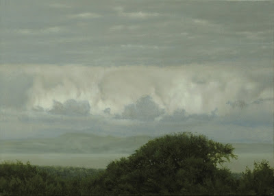
Nice little cloud study, from a photo I took in October when up Craiglockhart Hill. You’re facing broadly north-eastwards – you can see Fife across the Firth of Forth, and if you look closely there’s an indication of the Lomond Hills. It was just a quick snap of the light on the cumulus clouds, but I tweaked the foreground trees, and the near coast a bit, and I think I’ve ended up with quite an interesting little composition.

It would’ve been finished a couple of weeks ago, but I started it disastrously by not being able to get the tones and misty greys right – I was at least a couple of sessions down before I finally got to grips with them (which sounds ridiculous as it is such a tiny painting). The space between cloud ‘ceiling’ and the cumulus ‘wall’ is a little ill-defined and indistinct, but I could spend ages re-defining that so I think I’ll just leave it as is. Got there in the end though, and, as ever, the most successful bits of painting – the foreground trees – took the least bit of thought and trouble. There must be some way I can use that…

Not much else to say, really, except that the other week Madam and I went to the National Gallery of Scotland to see Carel Fabritius’ ‘The Goldfinch’ – which is on loan there from the Mauritshuis in The Hague. Earlier this year we’d actually been thinking about taking a little jaunt to Holland specifically to see it, then - who’d have thought – it turned up here in Edinburgh. It was on a special stand in the middle of the gallery, but cordoned off and only viewable from about six feet away from the front. Which was a little annoying. The real thing is very different from most of the reproductions I’ve seen. The colour is quite subdued - though the pale yellow wing flash leaps out – but I did get a new sense of how just cramped into the right side of the painting the bird is, and how it seems to sit in its own shadow. There is a theory that it’s designed to be a piece of trompe l'oeil – so true-to-life that you’re tricked into thinking it’s real - but I’m not so sure, as the shadows seem a little inconsistent. The perches are lit from above, but the main shadows seem to slant upwards. This indicates, to me, that the light source – probably a window - is below, which, cruelly, means that the bird cannot ever see the sky. 

The ropes at the side allowed me to stand a bit closer and I was able to get a better look. The quickness of the drawing is superb. The painter has introduced a slight droop to the tail feathers, but as I leaned in close enough to focus clearly on the face I was shocked. This wee bird looking at me was so sad, so beaten, so hopeless. I can feel it still.

The picture was painted in 1654. I saw it in 2016, and it reached out.

That is what very good painting can do…


Tuesday, October 11, 2016

Big Cumulus

oil on card 30x25cm

Google streetview is an excellent tool for sourcing landscapes, but it’s also pretty useful for finding skies as well. The source for this very small painting is from Russia – just outside a town called Kalachinsk, about fifty miles east of Omsk – where the summer weather has generated a dynamic sky, and the flat landscape allows an uninterrupted view of it.

I’ve tweaked a couple of elements from the original image; the hillock at the right edge has been developed from a clump of trees as a compositional support, and I’ve generally turned the colour up a bit. 

I wanted to play with the blue, and I fancied having a patch of clear sky separating the main clouds for some reason. I couldn’t make it work though. Madam couldn’t see at a glance which one was nearest, so I drifted some of the cumulus on the right behind the closer central one, and that’s made that space feel a bit more secure. Pimping up the blue meant I had to develop (invent) some aerial perspective, so I introduced an Ultramarine glaze fading upwards from the horizon, which I have to say works very well. It’s a shame that the distant clouds under the glaze weren’t done a bit more carefully though; the paint was quite clumsy and ‘lumpen’ – not smooth enough – and I think that hinders the near-to-far recession.

On an interesting technical note though, I returned to my old enemy Radioactive Blue for a more intense clear sky colour. I used a tiny bit of it – handled at a distance with tongs, and shielded by protective clothing* - with Ultramarine and Zinc White in a fairly translucent base mix, and built up a couple of layers of Ultramarine glaze on top of it. That system produced a blue that I’m quite pleased with, but it did mean that I had to spend extra time de-toxifying my brushes. My antipathy to this pigment goes back some time, and I made a solemn vow to never, ever, use it again, as it taints and stains everything it comes in contact with. My use of it here, however, rather proves that one should never, ever, say never.

That’s about it really. It didn’t quite go to plan and took far too long, but I’m glad I kicked it into something approaching what I had in my head. Oh, and I’m quite pleased with the painting of the ground and trees. As usual, the bits which took the least effort and thought turned out the best…


* I didn’t really. I was using ‘humour’ in that sentence to convey how powerful Pthalocyanine Blue is. It seems to have a mind of its own and delights in contaminating your brushes, palette, and household. One of the cats actually had a patch of it on his fur and I have absolutely no idea how it got there. 

Thursday, September 8, 2016

Portrait of an Arachnophobe

oil on canvas 91x91cm

No music this time, but here’s some birdsong to accompany the picture. It’s a lark. Life is short and it’s a long post, so let’s get on with it…

Two or three years ago I’d been reading about a group of Renaissance intellectuals in Wiltshire, one of whom was a Dr Moffett. He studied insects, especially spiders, and had a daughter - possibly the original Miss Muffet. I thought it might be interesting to work the story into a pastoral landscape, but I hit trouble fairly early as I couldn’t pin down how she was to run away, and the whole thing became stupid and pointless. However, I became interested in the idea of the subject not actually being there at all – an absence at the centre - even though that might require a lot more effort on the part of the viewer. 

If the landscape looks familiar it may be because it’s the one I was working out in last May’s ‘Downs Prep Sketch’. I used more recent sources for the nearest stuff along the bottom edge; the daisies are from Bruntsfield Links, just up the road. It wasn’t mentioned in that post, but there are three landscapes stitched together here, which I shall explain.

When future archaeologists dig me up and analyse my teeth, they will conclude that I spent my earliest years on the clays and chalks of London. From our house in Croydon, with good binoculars, you could look north and westwards along the North Downs edge into deepest Surrey. I would’ve loved to have used a view from the clearing in the woods behind us – ‘my’ playground - but the only source I have is wintry. In the painting, the central dry valley featured is actually the Devil’s Kneading Trough, in the South Weald in Kent. I’ve flattened it a little, but as a dramatic stand-in it works fine. 

The island in the distance is Arran. I was sent off to school in Ayrshire, and Arran was clearly visible from the upper floor, and from the Tarbolton road when we had to do exercise runs. The peaks were part of everyday life, and were the first real mountains I had ever seen. Scotland seemed a very different place from South London - I didn’t know strange words like ‘burn’ and ‘ken’*, and didn’t understand why I was being corrected by my pals when I referred to Britain as ‘England’ (I’m sorry, but I didn’t know any better).

The darker area this side of the water is the Edinburgh/Lothian section. It’s based on the view from the B7007 as it emerges from the Moorfoot Hills – a fantastic downhill cycle if you ever find yourself there; with the wind behind you, you’re freewheeling all the way to Middleton. This section features Arthur’s Seat, the castle (slightly exaggerated), the Pentland Hills to the left, and some modified high ground to the right. I have ruthlessly vaporised Corstorphine Hill - I needed to use the sea behind it and get a bit of light going on the left. There’s no compositional fault-line dividing the Lothian and the Southern landscapes; there’s quite a lot of inventive blending of the two sources, which I think works well. Edinburgh is not that big a city, yet the world comes to it. My family migrated north here in the 1960s, as did Madam twenty years later, from USA, and I consider myself very fortunate to have grown up here.

Now, I have to draw your attention to the bottom right hand corner, where there lurks an interloper. It’s no great secret that I feel distinctly uncomfortable around a spider, especially a large-ish one – it’s entirely irrational, but there you are. This was not an easy piece of painting to do. Just sourcing the spider images on the web was tricky - I very much wanted to see them, but at the same time I very, very much didn’t. I was flicking my eyes at the screen in little bursts of focus while turning my head away as if I was kid at the dentist’s. Painting the damned thing wasn’t easy either; I had a reference image eight inches across on the laptop screen, and I was making it appear a foot away from my face. It was the last element I added, and two days before I planned to start on it a large spider appeared in the kitchen. The next evening Madam and I were up the road watching the Festival fireworks and a similar spider took up residence on the kerb just beside my foot, which spoiled my concentration a bit. I really don’t know what the spider gods were trying to tell me.

This painting took an awfully long time, not because of technical problems, but because I didn’t really believe in it. I felt that it was overblown and only got drawn in once the surfaces got going. The whole thing is really about negative space – specifically, the negative space within the bowl of the valley and in front of the central plain. This is roughly the space which would have been occupied by the subject had he actually stayed put for the portrait. I even desisted from developing the cloud forms more fully because I felt that they would actually detract from the aerieness. Some of the paint is quite pleasing - I still quite like the sunlit central area - but I think the most effective bits of paint are where the distance goes back over the left chalk ridge, over the next shadowed ‘Lothian’ rise, and back yet further to the Pentlands, and Arran beyond. The annoying thing is that I barely thought about that section at all – it all came together very easily.

So, as it turned out, the original nursery rhyme idea ended up being an obtuse self-portrait - using elements of personality, historical geography, and a little wit. For all I know, it’s probably a recognised form, and frankly, it’s a wonder I haven’t done this before, seeing as how I regularly combine different landscapes. Ah well, there is nothing new under the Sun, as they say, and I’m now happily moving on to the next set of projects.

None of which involve small, harmless, scurrying things…

* In Scotland, a ‘burn’ is a small river, brook, stream, or beck. ‘Ken’ is an old Norse word meaning ‘to know’, and is also available in Northern England


Monday, August 1, 2016

4pm February

oil on card 30x19cm

Another little cloud painting, from a quick snap taken coming back to Edinburgh along the A9 last year. As far as I can remember it’s just outside Dunblane. Looking west, obviously.

It’s a fairly straightforward transcription of the photo. I’ve edited the odd awkward cloud out, but the photo was so dark that even after photoshopping the Dickens out of it I still couldn’t make out the landforms. I took my lead from the outlines of the trees and just made up the folds in the ground in between. It’s all about the sky anyway – the land just has to be there to support it. 

Most of the pigments used here are transparent or semi-transparent – so the white priming shows through the paint surface, as in watercolour - but I’ve used a little Titanium White in two areas. It’s an extremely opaque white, and I’ve used it in a pale pink band in the sky (where I went a little too uneven and dark), and I’ve added a touch to the fine grey scumble/glaze layer on the lower clouds to give them some weight (to contrast with the more aerie Paynes Grey/Raw Umber clouds towards the top). The red areas – made with two layers of the same Indian Yellow, Transparent Oxide Red, and Alizarin Crimson as last month’s ’Fight’ – were quite intense, but have been modified with the ‘cloudy’ fine grey to cool them down a bit at the lower cloud edges and rain drifts. Altogether, I think the whole sky ensemble is quite subtle and rather satisfying. There’s really not much more to say about this piece – it’s just an attractive little painting. 

And, it all went to plan. Which was nice…


Wednesday, July 20, 2016

Fight

oil on canvas 81x51cm

Finished at last, this month’s post is a very obvious sunset, based on my own photos taken locally. It’s the Meadows, in Edinburgh, looking south at Marchmont and Bruntsfield. I’ve flipped it left to right, so the Barclay Church at Tollcross is just out of sight on the left, and I’ve taken some liberties with the far trees and ornamental cherry avenues. There’s also a soundtrack for it, should you feel the need.

…Small digression - I’ve more good news. For the first time, I’ve had two pieces hung in this year’s RSA Open. They’re Oldies – Wreck No.1 and Bad Valley - but Goldies. So, if you happen to be around Edinburgh before August 30th, you can pop into the Royal Scottish Academy building – lower gallery of course - and see them (and loads of other stuff) for free…

Back to the main subject: It’s an OK painting, but definitely not as good as some I’ve done recently though, and it had a bit of An Accident. Anyway, have a closer look – its title is ‘Fight’ for a reason. I found the two blokes fighting on google - they were originally on a beach, and were rather stupid and funny. Then I realised that if they were darkened, their combined shape suggested something quite ugly and arachnid. The idea had – if you don’t mind – legs, and I could misdirect the eye away from their silhouette on the dark grass with the big technicolour sunset.

The Accident: Progress was fairly straightforward until my bike got a puncture. After fixing it, I was flipping my bike back upright (Works in Progress are hung in the hall, above the radiator) and carelessly scraped the handlebar down a couple of inches of the smooth, flat surface, which caused an extremely annoying ridge. At one point I was considering cutting the whole left side away to get rid of it. Which would have been a shame as I really liked the fade from the hot ‘Sun’ to the much cooler left edge. A patch on the back helped a little, but the flaw was in a deliberately featureless area, and would interfere with the blurred and stroked surface I had planned. The solution I came up with – not entirely successful, but which did help to disguise the surface damage – was to use small, thick, unsoftened strokes of paint for all the foreground grass – not the texture I wanted. Anyway, it’s done now.

The paintwork that I am pleased with, though, is the layering of glazes, plus the odd thin white layer, around the Sun. They’re a heavier mix than normal – based on the usual Stand oil, but with slightly more Damar resin and less turpentine. Particularly pleased with the hot ‘peachy’ areas, which use incandescent mixes of Indian Yellow, Transparent Oxide Red, and Alizarin Crimson. To be honest I’ve gone a bit over-the-top with the hot stuff in the sky at the expense of the cool blues, and I promise that I‘ll be a bit more discriminating about where and when to cut loose with them in the future. 

There may be a more subliminal reason why this painting has ended up being so very lurid and overcooked. Perhaps I’ve been over-affected by recent events, both at home and abroad. In the previous post, I alluded to a Big Moment, and that perhaps the UK was in for yet more stormy political weather. Well, I wasn’t wrong; the EU referendum went Leave’s way, so the whole United Kingdom is now heading out of the European Union. This caused the then Prime Minister (‘I’m not a quitter’ – the day before the vote) to announce his resignation the day after it, and the main opposition party to disembowel itself publicly for some inexplicable reason. There was carnage on the successful ‘Leave’ side as its main proponents either resigned or were savaged by each other in their attempts to be the governing party leader, and we now have a new Prime Minister who has slaughtered* the previous PM’s cabinet and set the remaining ‘Leavers’ on course to carry the electorate’s wishes through. So out we’ll go, much to the bemusement of the rest of the civilized world. 

So, if I can sum up how my own perception of the imagery in the painting evolved – and I do hope you’re enjoying the soundtrack – we have at first glance an exaggerated sunset. Which is nice, if a little clichéd, until you see the two blokes intent on destroying each other. It doesn’t stop there, oh no, because I have to admit that as I worked on the figures, the distant ‘flash’ on the horizon became more threatening, and deadly. And I think we all know what that’s about.

Done now. Back to normal. It’s just a nice sunset, and a nice park, in which two blokes are having a fight, OK?

Now, lest I get too political and flag-wavy in what is essentially a blog about making marks with coloured pastes, let me re-set my composure and equilibrium and just say that -
a) I feel that it’s not all over yet, and every cloud has a silver lining
b) We’re doomed, I tell ye, we’re doo-oomed…


*Not literally of course

Thursday, June 23, 2016

Window Work, an Interlude

watercolour

So, Window Work drawings again. 

I’m having a bit of a pause, a rest from full-on easel work just now. For a start, the last post, from way back in April, was such a gob-smacker of a painting (and I don’t mind saying that myself) that I wanted it to be the top-title blog post for a while. Secondly, Madam is having a few weeks off, so I’m taking it easy too. Thirdly, there’s a lot of Events going on at the moment, which sap the concentration; namely, the European footy cup, a dirty great big Referendum on whether UK should leave the European Union, and some of my paintings are in the inaugural show of the newly relocated Union Gallery – about which, more directly below. That’s not to say I haven’t been doing any work at all over the last couple of months, it’s just that it’s not been very intense work. It’s not very finished either, hence the Window Work post, but you can see it in progress through the Work in Progress link if that’s any consolation. If you have the ‘Info’, or ‘Captions’, or image text showing you’ll be able to read all sorts of technical stuff (the notes are for my own benefit really, so that I don’t forget what I’ve used, but I honestly don’t mind anyone else seeing them). Normal service will be resumed shortly.

Now, some gallery promotion/publicity details… 
If you’re in Edinburgh at all over the next month or so, I’d urge you to go and see the above-mentioned new Union Gallery. It used to be in Broughton Street, but is now in a much larger and grander premises at 4 Drumsheugh Place, in the West End, Edinburgh. The ‘Reunion’ show opened at the very end of May, and will be on until the end of July, so there’s still lots of time – but not too much – to go along and have a look at the very varied work on show, and who knows, maybe buy something.
There, now you know…

I suppose I should really be telling you about the drawings above. As you may be aware, I do them as exercises, and they tend to have phases of being in bad or good form. These ones mark a small swing towards a period of better form (I hope) and have been done during the final phase of a very shrill campaign about Britain’s future. The vote itself - whether to Remain in the European Union or Leave it - is taking place today, so I’m writing without knowing the result. The pre-vote polling is absolutely balanced at 50/50, but today, while the actual voting is taking place, there is a ban on campaigning throughout the media. The resulting ‘normality’ is pleasantly calm – though it may prove to be more like the eye of a hurricane. Nevertheless, I’m enjoying this little Interlude while it lasts.

Anyway, back to the drawings. The lady on the left is included purely because of the economy of line, and I quite like the untidiness of the ‘tonal’ girl on the right – she was actually like that – and I think her knees and face come across very well. Of the four drawings I like the larger image best; it’s a very interesting angular ‘pose’ and it was one of those sketches that seemed to draw itself, which is nice experience. What they have in common - like most people in UK over the last few days – is that they are conscious of an imminent Big Moment in which they’re about to participate. 

And the wee dog? He hasn’t a care in the world… 

Thursday, April 21, 2016

Landscape with Shadows

oil on canvas 90x70cm


This was actually started way back in April 2014, and was worked on in four or five blocks of time over the last two years.

There is some sound to go with it, but because of the extended production period I’ve listened to all sorts of music and radio during that time, and there’s nothing that I can really call a constant. When I’m working I’m sometimes listening to drama or speech stuff, and sometimes I need to be energised with a bit of rock or pop - mostly oldies – though that doesn’t always result in better painting. Usually, I’m looking for something that will tick over and produce an introvert mood, but stimulating enough that I can find resonances between what I’m hearing and what I’m trying to produce. Two pieces that did that during this painting’s final approach recently were the aptly titled ‘Falling Shadow’, and the more haunting ‘Path 5 (delta)’ – both by Max Richter

The finished composition is a combination of two very different sources. The landscape setting is an anonymous roadside in Russia, from google streetview. It’s nothing special, just some country about 80 miles northwest of Moscow, but I liked the light, and the arrangement of the trees and bushes. The figure is from a US army film* documenting the WWII ceasefire in Czechoslovakia. The cameraman was filming the German soldiers coming over to the Americans, but he happened across a group who had been set upon by Czech partisans. Some had been beaten – and are clearly terrified - but others were killed, one of whom is a beautiful young boy. 

The catalyst that linked these two images is Brueghel’s ‘Landscape with The Fall of Icarus’, at which I was having a good look at the time. In that painting, if you look closely behind the tree on the left you’ll see that Breughel has placed what could be a body under the hedge. Copying Mr Breughel, I simply took the German boy and placed him under my found bushes. I swapped my source sky and background for a more open view from along the road, then flipped it all left to right so that the figure was in the lower right-hand corner.

The shadows cast onto the ground and bushes are from trees directly behind the viewer, and I liked the dappled foreground against the full-lit distance - and the dappled lighting helped make the boy less obvious. I had a lot of trouble trying to work out the structure of the trees and bushes from the source, but I think I’ve got away with it. But it’s all about the light bouncing around anyway, and I was careful not to go too dark, and kept the whole scene bright.

I’m weaning myself off Lead White (sigh), but as I had started with it, I kept on the palette throughout. Which was very pleasant. It was very necessary too; for some reason the surface developed a long surface ridge right in the middle of the sky. It was an area I wanted to keep absolutely free of cloud – which could have helped disguise the anomaly – so I had what I euphemistically called ‘a problem’. I filled both sides of the ridge with stiff tinted Lead White, and left it to dry thoroughly – for several months. I rubbed that down, then did it again. Finally, the surface was smooth enough to proceed, so I finely matched in the colour then overpainted the repair together with the rest of the sky. I used the Lead White because I knew that it would dry right through very evenly, and that it was the same substance as the rest of the painting. I could have used a rapid-drying epoxy filler, but I feared that after a few years of the canvas expanding and contracting it would simply detach and fall off. Time will tell of course, but under normal conditions, now, you really can’t see that there’s been a repair. Which is a Good Thing, and would have been more tricky with slower-drying and weaker Titanium White. So there.

As usual I’ve used layers of fairly thin paint (no specific reason; I just prefer thin paint) but was getting in a state about the warmer pales over darks going cool in colour. I finally gave up laying thin cadmium oranges over the shadows in order to get dull brown, and simply drew with ‘generic’ pales – yellow ochre or something like – then glazed over with Burnt Sienna or Umber. A little trick which really has proved very useful since.

There is, of course, yet another layer of resonance for me within the painting. My grandmother – Nana – had a framed print above the piano in her front room in Streatham, in London. It was of a young boy lying on his back in the sun, and I was fascinated by it. That print will have long disappeared by now, but I discovered five decades later that it was of Franz von Lenbach’s ‘A Shepherd Boy’. It may be that part of the reason that I was so struck by the boy in the film was that he is so similar to that long-remembered figure, even down to his red jersey. 

Though, one has his whole life ahead of him - and the other has not.

US army film* The figure appears at 6.16mins. Please bear in mind before viewing that this is raw, uncensored footage. The boy appears at 6.16mins

Tuesday, April 19, 2016

Window Work

watercolour

Celebrating the 600th A4 Window Work sheet!

As you may already know, these are my exercise pieces – drawing people, or the occasional sky, out of the window for about 30mins most working mornings. I usually get about eight or nine figures to each A4 sheet, so that gives you an idea of their size. Much more often than not, they’re not very good at all (this morning’s were awful so these are a selection of the best from the last few weeks) but sometimes they’re quite ‘true’. 

I’m lucky to live where there’s a window looking along the road, and it’s very pleasant to sit - mug of tea and brush at the ready, on the alert for slow-moving old ladies or strange gaits - while listening to old BBC radio comedies like ‘Old Harry’s Game’ or ‘Ed Reardon’s Week’ for when nothing’s happening.

So, that’ll be me starting on the next hundred tomorrow morning.

And just as you thought you were getting away with no links to a music track…


Wednesday, March 23, 2016

Laika in Bliss

oil on canvas 66x51cm

If this piece looks familiar that’s because it’s a development of the watercolour posted a couple of months ago. I’ve simply added some ground forms - adapted from photos of Bruntsfield Links I took specifically for this project (I rushed up there with the camera when I realised that the light was just as I wanted it). I’d long been planning a piece about Laika, but having seen the potential of this sky for ‘heavenliness’ I dumped my previous idea in favour of this one.

There is a mood setter for this – Max Richter’s ‘Maria the Poet (1913)’. Even though the words are in Russian, the syllables are beguiling, and as a piece of music it’s the overall effect that matters. There is a recent translation, but I can’t tell whether it’s a good one as, sadly, my Russian simply isn’t up to it.

Technically, this painting is quite interesting. For a start, it was completed fairly quickly - I avoided being dragged into unnecessary detail, and treated the trees quite freely.

There is good, efficient use of glazing here as well, especially in the trees. They were laid in with a neutral Paynes Grey/Burnt Umber mix, lighter tones being either the grey primer showing through, or additions in a similar grey. For the leaf colour I glazed them over with semi-transparent Yellow – giving me a basic transparent green which was further tweaked with darks and yellows. This varnishy yellow glaze gave me singing highlights in the grass too, reinforcing the effect of sunlight.

The sky, as usual, was built up with veils of thin paint, but I added dabs of very thin Lemon Yellow glaze around the edge of the Sun and the cloudlet below it, and a wider thin Magenta glaze spreading and diminishing outwards. I faded a thin Zinc White glaze over them at the Sun itself, but there remains a hint of iridescence, which gives a strange hallucinatory light – much more subtle than straight white light. (I’ve nearly half-blinded myself when trying to work out how the Sun appears to affect the atmosphere immediately around it. Not a good idea, and I think I have enough clues for now not to be doing that for a while). 

I painted the setting with only a vague idea of how I would introduce Laika. I’ve always been a bit distraught at the thought of that little Russian dog. 

If you haven’t heard of her, she was the first dog in space; sent into orbit by the USSR space programme, back in 1957. They needed a small dog, and she just happened to be the stray they chose. The problem was that there was no way she was ever coming back, and so she died up there in her tiny capsule, and that thought has upset me – with no lessening - ever since I became aware of the story as a child.

I knew she would be placed in that important bottom right corner, but how would she be? Active? Passive? If she was active what was she doing? As a pack animal, would she be happiest in a pack of heavenly dogs. At one point I taped some cellophane onto the surface and painted Laika trotting in from the right towards a group of four or five other dogs snuffling around on the left (very difficult painting tiny, tiny dogs that look like dogs). The scene was charming, but it just looked like some dogs having fun in a park. There’s nothing wrong with that, but it lacked the intensity I was after.

After a lot of deliberation, I decided that there would be no context for loneliness, or play, or any of those earthbound concepts in Heaven. I looked through my ‘happy dog’ sources and settled on a photo of the small dog that I saw while up at Bruntsfield (serendipitous or what…) and used that as the model.

So, if you look at the bottom right hand corner you‘ll see a tiny Laika – black ears just recognisable at 2cm tall - attentive but alone, sitting up, and gazing at the Sun. Here - in my mind - she needs nothing, but exists in peace and safety, forgetting all, at one with everything, bathing in the Lux Perpetua.

Laika in Bliss…


Thursday, February 18, 2016

Day’s Work Done

oil on canvas 66x51cm

It’s a very pleasant feeling when a problem painting is resolved; the shoulders loosen and drop, and there’s a general feeling of ‘and relax…’ Or, as in this case, ‘phew, done…’ 

Before anything else, I should give a nod to the mood-setter. I was half-listening to random singles while setting out the figures, then ‘Smells like Teen Spirit’ came on, and it put me straight inside their heads. The sheer rawness is the thing, and I’m afraid the neighbours may have suffered a little when I started each session. The painting’s title indicates that this is evening, and that the young men are returning from doing what callous young men in militias do. In my head, they are the perpetrators from ’Road’, though I should stress that the two paintings were not designed to be linked.

The landscape source, google streetview again, is in Slovenia. I’d spotted a similar steep wooded area just along the road, but was having trouble making it work. Gravity pulled the wooded slope straight off the bottom right-hand corner, but with the blue sky and rock outcrop the composition became stable. I’m hoping that the figures won’t be found immediately, and I’ve tried to distract the eye with the blues, yellows, and fiddly bits of leaves and plants.

Even though the tonal range spans murky black to bright white, it is a very dark painting. I think the trees against the blue areas have worked particularly well, though I’m a bit disappointed by the foliage texture in front of the white cloud. I’m also not totally sure how the viewer will interpret the bright yellows. If you want to do it the hard way and work them out for yourself, ignore the footnote* containing the subtlest of hints underneath. 

On the technical side, there’s quite a lot of ‘Glazing’ going on here. Glazes are thin transparent layers of paint in a mixture of oil and a simple varnish – I use Damar resin dissolved in turpentine. The idea is that the glazing layer acts like stained glass – the layer below is visible through a veil of colour. This is very evident in the two figures on the right – the colours are simply washed over the monochrome drawing underneath. The more transparent your pigments are, the more effective your glazes will be. Some pigments, e.g. Yellow Ochre, Venetian Red, and the Cadmiums, are completely opaque and are not so useful in this context, so you have to choose your paints carefully. The sky is straight Ultramarine, and is stippled fairly loosely over the trees and foliage in front of it. The opaque bright yellows are intensified by a couple of layers of Indian Yellow and Transparent Red Oxide (from Michael Harding paints) – a very rich combination, which also contributed to the reddish ground colour. I boosted the Damar varnish proportion of my usual medium for these layers, and am quite pleased how that turned out. Interestingly, the original Indian Yellow pigment was made in India by feeding cattle exclusively with mango leaves, then processing the resultant urine. In more recent times it was considered cruel, and the practice was discontinued. Modern ‘Indian Yellow’ pigments are made from a variety of chemical dyes. Which I suppose is a Good Thing.

Well, I’m very glad that’s finished and I can give Nirvana a rest. I bet the neighbours are too…


* OK, I apologise for not doing them better, but the yellow patches are sunlit trees seen through the shadowed foliage of the trees in front. I’ve exaggerated the colour to distract the eye from the figures. Not particularly realistic maybe, but you must admit they’ve got a nice glow about them.

Wednesday, January 27, 2016

Sky Study – Dunblane

watercolour 24x12cm

The two oil pieces are still on the go, so I dashed out a quick little watercolour exercise yesterday afternoon to catch the end of the month.

This particular little Sky Study is from a snap taken at Dunblane station last year, and features some very nice patches of backlit Altocumulus. My usual train gets in at about midday, so the Sun is as high as it’s going to get for September.

It’s been a while since I’ve worked up a watercolour, so I was a bit hesitant in starting. I’ve mucked up the masked border - hence the bleeding edges – which I’m a little annoyed about. I’m thinking that I didn’t press the bleeding masking tape down bleeding firmly enough. The sky went quite well though; the blue element is the Indanthrene Blue I bought last year - unlike Ultramarine it doesn’t granulate in watercolour. I tried scraping the paper under the Sun for pure whiteness, but as it’s only 200gm paper there’s only so much of that you can do, so I thought better of it and used white acrylic ink for the re-lightened bits. Looking close-up at the clouds, the acrylic marks are a bit hard, but the Sun and the soft atmospheric shine have come across quite well. From a reasonable distance it’s OK, and I think it might be worth having a look at the source photos again and maybe developing this into a larger oil piece. 

There was no music on, but I did listen to Richard Herring’s Stephen Fry interview podcast while working. Herring deploys his usual juvenile bonhomie and coaxes some good stories and repartee out of Fry. You can stream it or download the MP3 for later. A pre-listen heads-up: It does contain a lot of very bad language - still very funny though, and some of it’s in the best possible taste. There is a whole series of these conversations – ninety-six at the time of writing – with other comedians and writers, from relatively obscure ones to the likes of David Mitchell, Eddie Izzard, Phil Jupitus, and Dara O’Brien.

This was my third day of working with my new glasses. Up till now I’ve been wearing varifocals, which are fine but have a fairly narrow field of useful vision. I’ve now got a pair of bi-focals - inspired by seeing Peter Blake wearing them in a TV interview. Their focal lengths are much more defined – just near and far - but present a much wider field of vision without the need to move my head from side to side. They are great for working at the easel and the window work, and in general it’s a bit like taking the blinkers off. Which is nice.

And yes, I did go to Specsavers*…


* Specsavers is a popular high-street chain of opticians, well-known in Britain for their amusing adverts. Other opticians are also widely available, but have less memorable catchphrases.